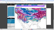
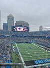
To set the tone for December: Post your best Saturday football snow photos.....so far here's Alma vs Wisconsin-Platteville.
-
Hello, please take a minute to check out our awesome content, contributed by the wonderful members of our community. We hope you'll add your own thoughts and opinions by making a free account!
You are using an out of date browser. It may not display this or other websites correctly.
You should upgrade or use an alternative browser.
You should upgrade or use an alternative browser.
Misc General Banter Thread
- Thread starter Rain Cold
- Start date
To set the tone for December: Post your best Saturday football snow photos.....so far here's Alma vs Wisconsin-Platteville.

Sent from my iPhone using Tapatalk
Drizzle Snizzle
Member
Tomorrow will mark the 100 year anniversary of the only tropical system to make landfall in the US in the month of December !
Brent
Member
First season since 2015 with no US hurricane strike!
Tsappfrog20
Member
Time for worship hopefully I can pay attention lol. I love Winter Weather Season!
Sent from my iPhone using Tapatalk
Sent from my iPhone using Tapatalk
SnowNiner
Member
Waking up to 38 and rain this morning. 34 and rain for Tuesday. Winter in the Carolina’s is here!! lol.  Hopefully we step down into glory through the month.

What the heck is going on today ? I see 30s in parts of North GA and close to 70 in parts of South GA right now.
I think South GA is further south than N Ga?
Happens a lot during a wedge.Yeah but I don't think there's usually a 30-40 degree difference on a typical day.
Im sure its been covered before in here but I haven't seen it and have to ask. Why are there differences in the graphics on the models depending on which site you look at? I know the precip maps are not what you should be looking at but more so the atmospheric conditions.I can't believe I'm the first person to post this. Y'all need to wake up in here! Winter is coming.
View attachment 177257
I was disappointed too after the good vibes I was getting yesterday. It's not very encouraging when the GFS and ICON are the only models in your camp supporting a particular solution.I was expecting to wake up and see some nice fantasy runs. Nothing but cold rains.
- Joined
- Jan 23, 2021
- Messages
- 4,602
- Reaction score
- 15,197
- Location
- Lebanon Township, Durham County NC
It’s amazing how you are completely ignorant of your states climate after all these yearsYeah but I don't think there's usually a 30-40 degree difference on a typical day.
Tell me you're a troll without telling me you're a troll. Don't y'all get tired of the same 'ol schtick
Im sure its been covered before in here but I haven't seen it and have to ask. Why are there differences in the graphics on the models depending on which site you look at? I know the precip maps are not what you should be looking at but more so the atmospheric conditions.
So on a technical side, the data is all the same inside the grib files. IE the raw data inside the grids (the km thing), like little squares.
When you manipulate the grid or generate graphics from the grib data onto the maps, the maps can appear differently depending on how much resolution their actual plot is.
For example, one site uses a low resolution usa map, it'll appear more blockish.
The color tables matter a lot too. Think of it like a radar app such as GRLEVELX. With a software like that, you can get finer and finer smoothing with more color steps in the color table. In other words, if your color table has 4 colors it in, you're going to see sharper cut offs. But if someone uses a color table that has say, 15 colors and they progressively step up in shade.. like light light blue > light blue > medium blue > dark blue etc, you will see better smoothing.
When it comes to precipitation type, some people lazily generate them and just go off the actual model's offered parameters in the grib file. Some models will for example, have a "categorial freezing rain" type of table. When models have this, scripts can be written to actually take a look at that table along with the actual precipitation and decide if it should be printed out as ice or not.
You won't find many of these types of maps, because the more advanced the scripting, the less friendly it is for both a programmer/map site, and more computational power it would require over the whole dataset. Therefore you end up with lots of maps showing ZR and sleet as snow on the snowfall maps. This is because they have not gone through the process of actually separating out the precipitation types with logical scripts. Again, sometimes it's laziness, sometimes the model's grib file doesn't provide it, and other times, its for computational reasons.
A good example is this: take a look at the instantweathermaps site. It's one of the absolute fastest websites, along with StormVISTA. The maps are low resolution and not very detailed. So while we get an initial idea of the overall forecast, we wait for the higher resolution maps that have better smoothing/graphics quality. Those two sites are meant to be as fast as possible, while offering lower quality, but they're generally using the same exact base model data.
Last edited:
Thanks, that makes sense!So on a technical side, the data is all the same inside the grib files. IE the raw data inside the grids (the km thing), like little squares.
When you manipulate the grid or generate graphics from the grib data onto the maps, the maps can appear differently depending on how much resolution their actual plot is.
For example, one site uses a low resolution usa map, it'll appear more blockish.
The color tables matter a lot too. Think of it like a radar app such as GRLEVELX. With a software like that, you can get finer and finer smoothing with more color steps in the color table. In other words, if your color table has 4 colors it in, you're going to see sharper cut offs. But if someone uses a color table that has say, 15 colors and they progressively step up in shade.. like light light blue > light blue > medium blue > dark blue etc, you will see better smoothing.
When it comes to precipitation type, some people lazily generate them and just go off the actual model's offered parameters in the grib file. Some models will for example, have a "categorial freezing rain" type of table. When models have this, scripts can be written to actually take a look at that table along with the actual precipitation and decide if it should be printed out as ice or not.
You won't find many of these types of maps, because the more advanced the scripting, the less friendly it is for both a programmer/map site, and more computational power it would require over the whole dataset. Therefore you end up with lots of maps showing ZR and sleet as snow on the snowfall maps. This is because they have not gone through the process of actually separating out the precipitation types with logical scripts. Again, sometimes it's laziness, sometimes the model's grib file doesn't provide it, and other times, its for computational reasons.
A good example is this: take a look at the instantweathermaps site. It's one of the absolute fastest websites, along with StormVISTA. The maps are low resolution and horrible. So while we get an initial idea of the overall forecast, we wait for the higher resolution maps that have better smoothing/graphics quality. Those two sites are meant to be as fast as possible, while offering lower quality.
No worries.Thanks, that makes sense!
I'd also like to note, this is the biggest reason why a site like ours doesn't have weather model data.
- It costs a lot of bandwidth to download the model files.
- We need a lot of computational power to process it.
- We then would need to offer the images, costing even more bandwidth
While there are some services/models like NCEP that you can "zoom in" and just request what you're interested in from the model files, it's still a lot of back and forth with data. For the model data providers that don't include this tech, we see grib files get very large into the multiples of gigabytes for each forecast hour.
Now considering there are a lot of models these days, you can see how the cost would exponentially increase when each of these models are producing 4+ forecast cycles per day. That's not even counting the storage space needed.
Give me an example of what you mean.Im sure its been covered before in here but I haven't seen it and have to ask. Why are there differences in the graphics on the models depending on which site you look at? I know the precip maps are not what you should be looking at but more so the atmospheric conditions.
Give me an example of what you mean.
Same time frame on the 6z GFS on Pivotal, compared to the 6z GFS you posted from TT. Pivotal barely had snow into Western NC but TT had it through most of SC. Again I know that looking at the atmospheric conditions on the models is what matters but always wondered why the sites showed differently. What weather nerd said made sense to me.

Gotcha. Yeah, I didn't see his response earlier. But what he said.Same time frame on the 6z GFS on Pivotal, compared to the 6z GFS you posted from TT. Pivotal barely had snow into Western NC but TT had it through most of SC. Again I know that looking at the atmospheric conditions on the models is what matters but always wondered why the sites showed differently. What weather nerd said made sense to me.
View attachment 177574
yeah, it's fairly simple to do; idk why more don't do it at least for the ptype maps:
Python:
if sfc_temp <= 32 and precip_06 >= 0.01:
    if 850mb_temp or 925mb_temp > 0.3c:
        draw_color("pink", lat, lon, shape)
    else:
draw_color("blue", lat, lon, shape)SnowNiner
Member
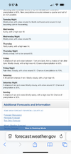
Yeah for real. I know we want bitter cold snowstorms all winter long. But most winters, we are pattern-chasing cold air until mid-January.I know the rain/snow forecast for later in the week is cold cold rain as usual, but I’ll take the multiple early season NWS mentions of snow in the forecast as good signs for later in the month. Weenie long range forecasting 101.
View attachment 177586
SnowNiner
Member
Yeah for real. I know we want bitter cold snowstorms all winter long. But most winters, we are pattern-chasing cold air until mid-January.
Agreed. Big picture this is early December. The earliest of the earliest. The fact that there’s even a possibility of chasing is kinda amazing.
Brent
Member
We got two snow chances in the next 5 days. That's pretty insane for the start of December tbh
I haven't seen real snow here before Christmas week since I moved in 21 and even that was barely real lol it was mostly just Arctic air
I haven't seen real snow here before Christmas week since I moved in 21 and even that was barely real lol it was mostly just Arctic air
Nerman
Member
I hate cold rain season but I'll take it over living above the Mason Dixon line
- Joined
- Jan 23, 2021
- Messages
- 4,602
- Reaction score
- 15,197
- Location
- Lebanon Township, Durham County NC
People are acting like day 16 is gospel. Didnt we just watch the midrange just flip completely last week in the span of 36 hours?
I will admit. It would be nice to see some fantasy runs start to show up.
SnowNiner
Member
I will admit. It would be nice to see some fantasy runs start to show up.
I'm hoping somehow the mjo 8 convection is not globally muted/erased by reflective sunspots and tertiary tachacardia of the west trade winds.
12/7I will admit. It would be nice to see some fantasy runs start to show up.
IGHT BET12/7
- Joined
- Jan 23, 2021
- Messages
- 4,602
- Reaction score
- 15,197
- Location
- Lebanon Township, Durham County NC
can't tell you how many chicken strips and strawberry shortcakes young ross inhaled at the wilmington k&w with my nana
Can’t wait to be NAM’d tomorrow, it’s coming…
- Joined
- Jan 23, 2021
- Messages
- 4,602
- Reaction score
- 15,197
- Location
- Lebanon Township, Durham County NC
Raleigh convention center on fire
got the tree up, its 37 and drizzle out, christmas music on, now i just need a snowy mountain webcam to yearn at
Nerman
Member
OK weather degens, Robinhood now has a predictions market for the weather. That means you can literally bet on the weather. They've got things like the high temperature of the day, rainfall in a month, snowfall in a month, number of hurricanes, etc.
This probably deserves it's own thread to discuss.
This probably deserves it's own thread to discuss.


