• Hello, please take a minute to check out our awesome content, contributed by the wonderful members of our community. We hope you'll add your own thoughts and opinions by making a free account!

Learning Global Warming facts and fiction

Status
Not open for further replies.
Now you're saying that I'm somehow completely degenerating your line of rationale or better yet "speak consensus to power" like I'm using the consensus as the main piece to my argument? Umm no, that's complete nonsense. I've been pretty kind and civil to you, trying to instill advice on you because I was at one point in your very shoes on this issue, referred you to pieces of literature and my own website even (which also has tons of literature attached to it) on the 19th & 20th century reconstructions, and correct me if I'm wrong but I'm very certain I've yet to mention "well "x" number of scientists say this" or anything even remotely related to that statement. At best, I was referring to how certain websites that are often heavily ridiculed by skeptics like yourself are run by actual climate scientists while WUWT, Real Science, & notrickszone are not (some of these esp the last one, are funded by fossil fuel corps btw who have a particular, subjective, non-scientific interest in spreading climate misinformation to the public and those who don't have the necessary training to refute or deeply delve into their arguments).

One can make a point without constantly approaching things with a “I know more than you attitude so I’m right and you’re wrong.” Read through your posts. It’s abundantly evident how you are approaching the discussion in this way. I’ve had discussions with AGW proponents who were able to make valid points without resorting to this type of behavior and it makes for a much more pleasant discussion. Having said that, the problem I have with a site like Skeptical Science is how they approach the issue with a preconceived view in mind and the goal of proving any skeptical line of reasoning as false or a myth. They often use the power of consensus argument or sometimes even cite only one or two sources to “prove” their point. Such an approach is no different than the skeptic sites you mentioned that often approach the subject of AGW in the same way except they are trying to disprove AGW.

The uncertainties in the data were at best glossed over and you're only now half-heartedly admitting they're size, but do you honestly think the uncertainities are small enough to where you can measure an actual signal in the data to claim the 1930s-40s was warmer or do you have any idea what the magnitude of the uncertainties are? That's all I really want to know. Instead you've chosen to side step this question or make very broadbrushed claims about the uncertainties without actually attempting to delve into them or produce literature that provided cold, hard numbers on these uncertainties.

I’m sorry but my intent in this topic was never to get into the technicalities of data sets, their weaknesses and strengths, or other detailed aspects. I have a family to take care of and two kids, I don’t have a ton of time to sit down and discuss those in detail which is why I linked the article so those interested can do additional reading and determine in their own mind if the data is valid or not. Having said this, the one graph that I did link uses a weighted approach according to the surface area, “The HadCRUT4 data series has improved high latitude data coverage (compared to the HadCRUT3 series) the individual 5x5 grid cells has been weighted according to their surface area. This is in contrast to Gillet et al. 2008 which calculated a simple average, with no consideration to the surface area represented by the individual 5x5 grid cells.”

See below for additional info on this topic that might answer some of your concerns/questions.

Additionally, I don't think you actually understand what the HADCRUT4 data you were looking at shows. Remember that HADCRUT4 only produces values for grid boxes where there is data, and the average for many of those grid boxes where this is data, only constitute a couple stations (or even one!), if there's no data, it's excluded, which also means they're only measuring at best one-third of the arctic (even less before 1935), and what about the other two-thirds? We can't just ignore that. Also, what if those stations used in HADCRUT4 aren't equally spaced apart in the grid box or are better yet on the edge of the grid box in question, do you think they adequately represent the temperature variations at those points? Likely no. Berkeley, ERA-20C, ERA-20CM, GISS, and Cowtan/Way's interpolation w/ HADCRUT4 along with other datasets all agree this period wasn't as warm and was far more likely to be less warmer than it is today, if you want to dispute that, it's fine, publish your own peer reviewed study or rebuttal, I'd be glad to read it. The raw HADCRUT4 data doesn't really suffice to say the 1930s-40s were warmer than the 2000s because it's actually not even measuring the entirety of the arctic to begin w/.

The graph you posted is comparing the temperatures to 1981-2010 vs 1961-1990 in the graph I posted. I’m not sure how that alters things but it’s not an apples to apples comparison as you tried to indicate. I still believe there is ample data to indicate the warming seen in the 1920-45 time period is similar to what we saw leading into the early 2000s and isn’t much different than what we have currently (although things now might be somewhat warmer in the Arctic, depending on the data set and analysis used). Furthermore, I can offer some peer reviewed and scientific evidence that agrees with my “broad brush” conclusion, as you say.

First of all the IPCC had this to say in AR5 chapter 10.

“A question as recently as 6 years ago was whether the recent Arctic warming and sea ice loss was unique in the instrumental record and whether the observed trend would continue (Serreze et al., 2007). Arctic temperature anomalies in the 1930s were apparently as large as those in the 1990s and 2000s. There is still considerable discussion of the ultimate causes of the warm temperature anomalies that occurred in the Arctic in the 1920s and 1930s (Ahlmann, 1948; Veryard, 1963; Hegerl et al., 2007a, 2007b). The early 20th century warm period, while reflected in the hemispheric average air temperature record (Brohan et al., 2006), did not appear consistently in the mid-latitudes nor on the Pacific side of the Arctic (Johannessen et al., 2004; Wood and Overland, 2010). Polyakov et al. (2003) argued that the Arctic air temperature records reflected a natural cycle of about 50 to 80 years. However, many authors (Bengtsson et al., 2004; Grant et al., 2009; Wood and Overland, 2010; Brönnimann et al., 2012) instead link the 1930s temperatures to internal variability in the North Atlantic atmospheric and ocean circulation as a single episode that was sustained by ocean and sea ice processes in the Arctic and north Atlantic. The Arctic-wide increases of temperature in the last decade contrast with the episodic regional increases in the early 20th century, suggesting that it is unlikely that recent increases are due to the same primary climate process as the early 20th century.”

Polyakov et al. includes this in their abstract:

“In contrast to the global and hemispheric temperature, the maritime Arctic temperature was higher in the late 1930s through the early 1940s than in the 1990s.” http://www.personal.kent.edu/~jortiz/paleoceanography/warm_apr02.pdf

3674CE9E-69FC-4418-A7F1-A94D86B078B2.jpeg


Yamanouchi had this to say and also referenced the Polyakov study

“It is known that a large warming event occurring from the 1920s to the 1940s in the Arctic, comparable to the recent 30-year warming, as observed in Fig. 3 by Polyakov et al., 2002, Polyakov et al., 2003a. The original objective of the former study was to confirm that the long-term surface air temperature (SAT) trends did not support the hypothesized polar amplification of global warming due to a large multidecadal variability; however, the authors did show that Arctic warming in the 1930s to the 1940s was exceptionally strong, reaching 1.7 °C, compared with the year 2000 maximum of 1.5 °C. Even though there was a global mean surface temperature rise from the 1920s to the 1940s, the actual increase was dominant mostly in the higher latitude.”

Then this which indicates this change was mostly in the Arctic region.
“The situation that a large temperature increase was mostly confined to high latitudes is most clearly indicated in Fig. 5 by Serreze and Francis (2006).” https://www.sciencedirect.com/science/article/pii/S1873965211000053#fig4

D3D9C0E2-D5DD-4EE8-BBDF-52D47B962BCD.jpeg


Sea ice extent from several studies https://www.tandfonline.com/doi/full/10.1080/02626667.2017.1324974
Figure 11. Comparison of our all-Arctic summer sea ice extent reconstruction with several other estimates in the literature: (a) Walsh dataset-derived summer extents; (b) Pirón and Pasalodos (2016) Alekseev et al. (2016) September extents; (d) CMIP5 modelled September extents; (e) our summer reconstruction.

1DAB952A-6BF7-48DE-AA92-CCFE2469A5B4.jpeg


Here was their analysis of the temperatures based on the GHCN dataset including stations north of 60N. The link above gives greater detail to their methodology.

C3D0E749-F7BC-48C7-B84D-D36826EA8392.jpeg


Finally, here are some datasets for various Arctic locations from the GISS network that have long histories of reporting. The general trends can also be observed in these graphs which indicate all locations experienced a general warming in the 1920-1945 range that is close to or similar to what we see today. I certainly realize these are only 6 locations but they give a good indication of the overall trends these areas have seen historically. http://www.climate4you.com/Polar temperatures.htm#Arctic monthly surface air temperatures north of 70N

D0F699CF-555B-4D73-97B5-3FA613DE1A23.gif


Wrt skeptical science and your other point, I'm aware of obvious errors and the lean of the website, but real scientists run them and they do focus on literature at hand instead of overused talking points that have little basis in science and more to do w/ geopolitics. Don't take this statement the wrong way or blow it out of proportion for what it really means, but the science is in fact settled and irrefutable that carbon dioxide, water, and methane, HCFCs, etc. are in fact greenhouse gases which by definition selectively absorb and emit outgoing longwave radiation at particular infrared wavelengths, warming the earth's surface. This has been proven well beyond any reasonable doubt in the laboratory and the field.

I agree completely and have not debated these ideas.


The part that's actually debated is how much these actually contribute to the warming of the climate and those who actually regularly published and are the most trained on the subject are far more likely to contend that it's a major player in the climate today and becoming a bigger player as time progress,

I agree as well that the effect of these is up for debate and that there are plenty of papers with various views on the matter. The bolded portion of your statement is leaning to a “consensus to power” line of reasoning, be careful.


those in the skeptical community have yet to prove beyond a reasonable doubt that the forcings are in fact not "major" from these GHGs, or a solid, alternative theory and instead tend to often resort to "one-dimensional" oversimplified arguments and line of rationale using correlations between natural oscillations and AGW for example as I delved into above, which is often their undoing and completely misleads them into thinking that "well the climate has changed to "x" before so it's warming now, therefore it's still mostly "x", " when in reality, like anything in mathematics or science, there are multiple ways to arrive at the same answer and conclusion, as there are multiple avenues to warm the climate, and what we're doing today simply isn't the same as any other point in earth's history and doesn't make the two comparable at least in that sense but in other ways they are similar of course.

I agree with most of the above, there is much we have to learn and uncover. What we are introducing into the atmosphere today with aerosols, fossil fuels, etc may be different and the studies on the effects of these are intriguing as well. However I will also add there are some interesting positions out there which attribute some or a large portion of the warming to various cycles or variability while also acknowledging that anthropogenic forcing has magnified these cycles/variances.

I'm not saying yourself and others in the skeptical community are completely inferior, lacking the necessary meteorological or climate science background and/or secondary education to delve into the subject, but they're very important to have and you can't deny that if you possessed this general suite of knowledge your opinion would significantly change. Sure, many have tried to train themselves extensively on the issue on their own time for leisure, etc (as I did for several years before going into college), but in the overwhelming majority (but not all) of cases, it's definitely not the same as actually following through at a distinguished institution.

There are plenty within the skeptical community who are well credentialed and incredibly knowledgeable. Whether you agree with their conclusions is irrelevant since your line of logic and reasoning here is based off of credentials and learning at a distinguished institution.

I just ask that you please stay on topic and stick with the discussion at hand on arctic 19th-20th century temperatures instead of trying to derail it and bring about a host of unrelated issues about so-called "groupthink" rationale, how politics are intertwined (which they definitely are) etc. because that's not what I'm actually concerned with nor what our previous dialogue was about. Those are certainly valid points of discussion for AGW in general, but I really would just like to stick to the actual science with climate change.

Since this thread is about AGW in general I have no problem with discussing the issues of “groupthink” rationale or other related issues that can affect data reliability and methodology. However, at this point my post is long enough and I will refrain from adding in data about that for the time being. That’s another discussion for another day.
 
Last edited:
Finally, here are some datasets for various Arctic locations from the GISS network that have long histories of reporting. The general trends can also be observed in these graphs which indicate all locations experienced a general warming in the 1920-1945 range that is close to or similar to what we see today. I certainly realize these are only 6 locations but they give a good indication of the overall trends these areas have seen historically. http://www.climate4you.com/Polar temperatures.htm#Arctic monthly surface air temperatures north of 70N
View attachment 5728

Snowlover91,
The one thing that bothers me the most about these 6 locations: the furthest north of these, Svalbard at 78.2 N, actually was much warmer during the 2010+ period (~-2.5 C) vs the ~-5.5 C of the 1930s. So, it was ~3 C/5.4 F warmer in the 2010s vs the 1930s and it was the furthest north.
Even Fairbanks was ~1.5 C/2.7 F warmer in the 2010s vs the 1930s. But my main point is the furthest north Svalbard being 5.4 F warmer. Doesn't this get in the way of being able to provide evidence that it was about as warm in the Arctic during 1920-45 vs recent years, especially with it being the furthest north?
 
"One can make a point without constantly approaching things with a “I know more than you attitude so I’m right and you’re wrong.” Read through your posts. It’s abundantly evident how you are approaching the discussion in this way. I’ve had discussions with AGW proponents who were able to make valid points without resorting to this type of behavior and it makes for a much more pleasant discussion."

If you actually stayed on the topic of arctic temperatures in the 19th-21st centuries instead of resorting to poorly constructed strawmen arguments about how I'm appealing to consensus/authority, etc, this discussion would certainly be a lot more pleasant.


"The problem I have with a site like Skeptical Science is how they approach the issue with a preconceived view in mind"

Pot meet kettle. Your subjective, heavily biased approach and attitude to this problem is very evident in every single one of your posts, even Larry (GaWx) is picking up on this, take a good hard look in the mirror.


The HadCRUT4 data series has improved high latitude data coverage (compared to the HadCRUT3 series) the individual 5x5 grid cells has been weighted according to their surface area. This is in contrast to Gillet et al. 2008 which calculated a simple average, with no consideration to the surface area represented by the individual 5x5 grid cells.”

You're completely oblivious to the larger point I was trying to make. First of all, I actually was talking about the HADCRUT4 timeseries earlier so this argument about it's better than HADCRUT3 is entirely mute from the beginning. Second of all, their improved coverage still only means about a third of the grid cells at best are covered by HADCRUT4 during the 1930s, you can easily check this using the KNMI Climate Explorer, what about the other two-thirds of the arctic that weren't measured, again apples-oranges, cling to this all you want but the reality is all the datasets show the 2000s are warmer and likely so.


"The graph you posted is comparing the temperatures to 1981-2010 vs 1961-1990 in the graph I posted. I’m not sure how that alters things but it’s not an apples to apples comparison as you tried to indicate"

It doesn't matter if I used 1971-2000, 1951-1980, or 1961-1990, the anomalies in the 2000s are still higher than the 1930s-40s in all the datasets I showed, no matter how you want to try & twist it. If the 2000-2010 anomaly is +2C, and the 1930-40 anomaly is +1.5C for example w/ 1951-1980 base period, then they both cool and warm at the exact same rate if you change the base periods, again the relative anomalies are what we actually care about here, whether the 2000s are warmer than the 1930s, which most would agree is the case. The few papers you've linked don't make a strong case for that and the Francis (2006) study is using data that ended in 2000, the arctic has warmed even more since then, the case for the 1930s being warmer would be even weaker.

As for the climate4you graphs, they were presented here with the y axes being very large and deceivingly compressed because it's hard to pick out even a 1C long-term temperature change in each of those, which is very important here in the context of whether the 1930s were warmer than the 2000s. The reality is they're not, and most of those stations, especially Svalbard are in fact warmer, in some cases by a longshot. As Larry alluded to above, this certainly gets in the way of being able to provide evidence the 1930s & 40s were warmer than the 2000s & especially the 2010s.


"However I will also add there are some interesting positions out there which attribute some or a large portion of the warming to various cycles"

The glaring problem with this argument is that natural forcing suggests we should have cooled in the midst of lower solar activity, the lowest in over a century in fact, a -PDO that's dominated most of the post 1998 era, and now a cold AMO to boot, global temperatures shouldn't have continued to rise but they have, and practically every year since the 2015-16 NINO is warmer than the 1998-2014 era, a clear sign that the globe is warming. Using mostly variations in natural forcing to explain ongoing temperature variability doesn't get you anywhere close to the answer.
 
Last edited:
"There are plenty within the skeptical community who are well credentialed and incredibly knowledgeable. Whether you agree with their conclusions is irrelevant since your line of logic and reasoning here is based off of credentials and learning at a distinguished institution."

This is another broad brushed statement that has little actual basis in fact. Let's break this down.

Learning at a distinguished institution has stringent standards & and is the rigorous mold the US and the world have taken to weed out individuals who are intellectually inferior, hate to say it, but this is the harsh reality. Good luck convincing any of your employers that having a college degree isn't "necessary" or is "irrelevant" as you were alluding to, you'll be laughed right off the job site. If 2 candidates with the same background including: job experience, volunteer work, personality, and relationship with the employer are applying for a job, the one that has the degree will get said job, employers understand the importance of a college degree, but apparently you don't. Those without degrees are certainly more than capable of teaching themselves about a topic especially in today's world w/ easy internet access, it definitely can be done, however being more successful at this than getting an actual college degree, and holding yourself to a high enough or higher standard than college, those individuals are VERY few and far in between, and are the exception not the rule as you're apparently trying to tout.

The overwhelming majority of the "skeptics"/deniers are mostly individuals who lack any necessary secondary education on the topic or are politically motivated by conservatives ideals and funding to only tout one side of the issue and spread climate misinformation. There are certainly some who are legitimately skeptical but the credentials on one side of the fence (pro-AGW) are clearly much higher in general than the other, and again I'll remind you those who are more successful at self-education over college are the exception not the rule.

Because I know how you like to twist and misconstrue what I say, let's get one thing completely straight and clear, do not assume any of the above means you need to have a degree to talk about climate change. However, if you want to be taken more seriously by your peers, the scientific community, the public, and myself and others here on the forum even, getting a degree will help you a lot. Is it the end of the world if you don't have one or more? No, but it's just a fact that it will only be to your benefit and solidify your reptuation. It's a fact that the base for those in favor of AGW have rigorously studied this topic for years and are individuals who actively publish in peer reviewed journals, work on the datasets that comprise AGW, actively use it in their own research, and are employed at distinguished universities across the globe.
 
Last edited:
I guess it shouldn't come to any surprise that the climate4you site is run by denier Dr Ole Humlum, who proposed that the sun and the moon explain most of earth's current climate change (lol), that the CO2 increases we're seeing today were natural (facepalm), and the earth would cool significantly between 2013 and 2030 (not looking good there either). Let's also keep in mind he works for the Academic Advisory Council of the Global Warming Policy Foundation, a think tank whose sole intention is to question and spread misinformation on climate change. Sigh...
 
Snowlover91,
The one thing that bothers me the most about these 6 locations: the furthest north of these, Svalbard at 78.2 N, actually was much warmer during the 2010+ period (~-2.5 C) vs the ~-5.5 C of the 1930s. So, it was ~3 C/5.4 F warmer in the 2010s vs the 1930s and it was the furthest north.
Even Fairbanks was ~1.5 C/2.7 F warmer in the 2010s vs the 1930s. But my main point is the furthest north Svalbard being 5.4 F warmer. Doesn't this get in the way of being able to provide evidence that it was about as warm in the Arctic during 1920-45 vs recent years, especially with it being the furthest north?

Hi Larry, great question as usual and I appreciate you asking! I think those graphs posted show in general the warming in the 1920-45 period was similar to what we saw up until the early 2000s. Some of the stations and areas in the Arctic have exhibited additional warming since then while others have remained fairly consistent. When pulling the detailed graph from the GISS database, it shows that Fairbanks for example has been fairly consistent. Unfortunately I can't get the Svalbard station to load further back than 1977 for some reason even though it's coordinates match up, I'm not sure why. Here's the link to the GISS dataset if you want to look at them in greater detail. https://data.giss.nasa.gov/gistemp/station_data/
station.gif


The Ostrov Dikson station also shows a similar trend.
station.gif

station.gif


One such station exhibiting some warming recently above the 1920-45 years is Akureyri
station.gif


The Hatanga location seems to have some bad data that was removed for some of the early years and only goes back to 1929 but still shows considerable warming then especially in 1941 or so when there was an unusual spike.
station.gif


Also, one of the studies I cited compiled GHCN stations as follows with the graph below:
"As we noted in Soon et al. (2015 Soon, W., Connolly, R., and Connolly, M., 2015. Re-evaluating the role of solar variability on Northern Hemisphere temperature trends since the 19th century. Earth-Science Reviews, 150, 409–452. doi:10.1016/j.earscirev.2015.08.010[Crossref], [Web of Science ®], [Google Scholar]), while the Arctic is a relatively unpopulated region and is therefore generally unaffected by urbanization, weather stations tend to be near/in human settlements. Hence, urbanization bias can still occur for Arctic weather stations, e.g. Hinkel and Nelson (2007 Hinkel, K.M. and Nelson, F.E., 2007. Anthropogenic heat island at Barrow, Alaska during winter: 2001-2005. Journal of Geophysical Research, 112, D06118. doi:10.1029/2006JD007837[Crossref], [Web of Science ®], [Google Scholar]), Konstantinov et al. (2015 Konstantinov, P.I., Grishchenko, M.Y., and Varentsov, M.I., 2015. Mapping Urban Heat Islands of Arctic cities using combined data on field measurements and satellite images based on the example of the city of Apatity (Murmansk Oblast). Izvestiya, Atmospheric and Oceanic Physics, 61, 992–998. doi:10.1134/S000143381509011X[Crossref], [Google Scholar]). Because we were restricted by the shortage of Arctic Circle stations, some of the stations (23%) we used for Soon et al. (2015 Soon, W., Connolly, R., and Connolly, M., 2015. Re-evaluating the role of solar variability on Northern Hemisphere temperature trends since the 19th century. Earth-Science Reviews, 150, 409–452. doi:10.1016/j.earscirev.2015.08.010[Crossref], [Web of Science ®], [Google Scholar]) showed at least some signs of urbanization, and so it is plausible that urbanization bias might have slightly contributed to the trends for that region. However, as the analysis in this paper covers a wider area than just the Arctic Circle, there are more stations available. Therefore, we only used GHCN stations that are “fully rural”, i.e. rural in terms of both associated population and night-light intensity; see Soon et al. (2015 Soon, W., Connolly, R., and Connolly, M., 2015. Re-evaluating the role of solar variability on Northern Hemisphere temperature trends since the 19th century. Earth-Science Reviews, 150, 409–452. doi:10.1016/j.earscirev.2015.08.010[Crossref], [Web of Science ®], [Google Scholar]) for a discussion." Full paper is here https://www.tandfonline.com/doi/full/10.1080/02626667.2017.1324974
GHCN.jpeg

I think based on this data it's pretty clear that the warm period in the 1920-45 period was at the very least on a similar level to what we've seen in the early 2000s (2005 and before) and the levels we've seen post 2005 vary depending on the dataset and methods used. The one I posted above shows both unadjusted values (a) and adjusted (b) and based on this the recent 2005-2017 period has been somewhat warmer than what was seen in 1920-45 but not several degrees C warmer like the chart Eric posted. I think the variance here would have to do with the datasets used, how they are compiled and averaged, how much data they include for both periods, etc.

However, even in the chart Eric posted it can be seen that before 2005 the warming in the early 2000s and late 90s was similar to that of the 1920-45 period. It may not be clear from my posts and I apologize if so, but my view would be that up until 2005 the warming we have seen was similar to the 1920-45 period and post 2005 is higher than 1920-45 by varying degrees depending on the dataset one looks at. I hope this clarifies what I was trying to say and I apologize if it was a bit unclear!
 
If you actually stayed on the topic of arctic temperatures in the 19th-21st centuries instead of resorting to poorly constructed strawmen arguments about how I'm appealing to consensus/authority, etc, this discussion would certainly be a lot more pleasant.

I think it is best if we both follow the advice of the mods here and keep this a pleasant discussion :)

Pot meet kettle. Your subjective, heavily biased approach and attitude to this problem is very evident in every single one of your posts, even Larry (GaWx) is picking up on this, take a good hard look in the mirror.

I always appreciate Larry's questions and his probing into the data. He has some fantastic observations and is far more knowledgeable than I am on a lot of things, especially weather and statistics. His question was a terrific one and I have since answered :)


The HadCRUT4 data series has improved high latitude data coverage (compared to the HadCRUT3 series) the individual 5x5 grid cells has been weighted according to their surface area. This is in contrast to Gillet et al. 2008 which calculated a simple average, with no consideration to the surface area represented by the individual 5x5 grid cells.”
You're completely oblivious to the larger point I was trying to make. First of all, I actually was talking about the HADCRUT4 timeseries earlier so this argument about it's better than HADCRUT3 is entirely mute from the beginning. Second of all, their improved coverage still only means about a third of the grid cells at best are covered by HADCRUT4 during the 1930s, you can easily check this using the KNMI Climate Explorer, what about the other two-thirds of the arctic that weren't measured, again apples-oranges, cling to this all you want but the reality is all the datasets show the 2000s are warmer and likely so.

The quote I posted was straight from the climate4you website explaining the data methodology used in the HadCRUT4 graph. It was their comparison to HadCRUT3 and mention that it was not a simple average and are weighted according to surface area. I think the data posted shows that prior to 2005, the 1990s and early 2000s have experienced similar levels of warmth as that seen in the 1920-45 period and post 2005 there has been additional warming which varies in extent by the dataset and methodology used. The graph you posted shows a spike around roughly 2005 but prior to that the warming in the late 90s and early 2000s was similar to the 1930s and 40s.


It doesn't matter if I used 1971-2000, 1951-1980, or 1961-1990, the anomalies in the 2000s are still higher than the 1930s-40s in all the datasets I showed, no matter how you want to try & twist it. If the 2000-2010 anomaly is +2C, and the 1930-40 anomaly is +1.5C for example w/ 1951-1980 base period, then they both cool and warm at the exact same rate if you change the base periods, again the relative anomalies are what we actually care about here, whether the 2000s are warmer than the 1930s, which most would agree is the case. The few papers you've linked don't make a strong case for that and the Francis (2006) study is using data that ended in 2000, the arctic has warmed even more since then, the case for the 1930s being warmer would be even weaker.

I would agree that the Arctic has warmed a bit since 2005 but also make note that the original point I was trying to make, although it may have been a bit unclear, is that stating the 2000s are warmer than the 1930s isn't entirely accurate. If you're talking about 2005-present then yes there has been some additional warming (the extent of warming varying based upon the dataset used) that is warmer than the 1930s. If you are looking at the early 2000s the data I posted along with your chart indicate that the early 2000s and 1930s-40s experienced similar levels of warmth. My apologies if this was not clear in my original statements.

As for the climate4you graphs, they were presented here with the y axes being very large and deceivingly compressed because it's hard to pick out even a 1C long-term temperature change in each of those, which is very important here in the context of whether the 1930s were warmer than the 2000s. The reality is they're not, and most of those stations, especially Svalbard are in fact warmer, in some cases by a longshot. As Larry alluded to above, this certainly gets in the way of being able to provide evidence the 1930s & 40s were warmer than the 2000s & especially the 2010s.

I have since posted graphs for 5 of the 6 stations that the climate4you graph cites in my response to Larry. I pulled the graphics straight from the GISS website and used the option to remove only suspicious records from the data. I think the GISS graphs I posted indicate the warming even recently isn't unprecedented for most of the stations. Unfortunately, the Svalbard dataset only goes back to 1977 when I try to pull the dataset, I assume they changed to a newer station since records only go to 1977 now.


The glaring problem with this argument is that natural forcing suggests we should have cooled in the midst of lower solar activity, the lowest in over a century in fact, a -PDO that's dominated most of the post 1998 era, and now a cold AMO to boot, global temperatures shouldn't have continued to rise but they have, and practically every year since the 2015-16 NINO is warmer than the 1998-2014 era, a clear sign that the globe is warming. Using mostly variations in natural forcing to explain ongoing temperature variability doesn't get you anywhere close to the answer.

I have no doubt the globe is warming. The question is what is causing the warming. Is it all anthropogenic, partly natural cycles/variability, or entirely natural? The two most popular that I've seen are that it is all/primarily man-made and then the other side where man has contributed to magnifying these cycles but the underlying drivers are natural cycles. Here is some interesting data surrounding this.
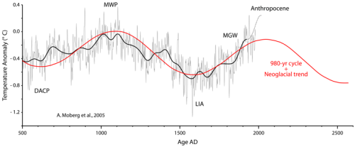
"However, the proposition that the world should be cooling absent an anthropogenic effect, contradicts our knowledge of Holocene climate cycles. One of the main cycles is the ~ 1000-year Eddy cycle found in climate and solar activity proxy records of the Early and Late Holocene (see: Centennial to millennial solar cycles). The periodicity of this cycle is maintained from Early to Late Holocene, and reflected in the Bond events of increased iceberg activity in the North Atlantic (figure 81). The start of the Medieval Warming ~ 700 AD, and the start of the MGW at ~ 1700 AD are separated by ~ 1000 years. The peak of the MWP at ~ 1100 AD and the trough of the LIA at ~ 1600 are separated by ~ 500 years (figure 103). Based on this cycle it can be projected that the period ~ 1600-2100 AD should be a period of net warming, to be followed by a cooling period ~ 2100-2600 AD, if the cycle maintains its beat (figure 105).


Figure 105. Warming and cooling periods of the past 1500 years, fitted to known climate cyclic behavior. Moberg et al., 2005, reconstruction of Northern Hemisphere temperature anomaly for the period 500-1978 AD (grey curve), and its low frequency component (black curve). The 980-year Eddy cycle is shown in red, with a declining Neoglacial trend of –0.2 °C/millennium. As Moberg’s reconstruction ends in 1978, the dotted line represents the 1975-2000 warming, that is similar in magnitude to the 1910-1945 warming. DACP, Dark Ages Cold Period. MWP, Medieval Warm Period. LIA, Little Ice Age. MGW, Modern Global Warming. Peak natural warming is expected in 2050-2100 AD."

"Physics shows that adding carbon dioxide leads to warming under laboratory conditions. It is generally assumed that a doubling of CO2 should produce a direct forcing of 3.7 W/m2 (IPCC-TAR, 2001), that translates to a warming of 1°C (by differentiating the Stefan-Boltzmann equation) to 1.2°C (by models taking into account latitude and season). But that is a maximum value valid only if total energy outflow is the same as radiative outflow. As there is also conduction, convection, and evaporation, the final warming without feedbacks is probably less. Then we have the problem of feedbacks, which are unknown and can’t be properly measured. For some of the feedbacks, like cloud cover we don’t even know the sign of their contribution. And they are huge, a 1% change in albedo has a radiative effect of 3.4 W/m2 (Farmer & Cook, 2013), almost equivalent to a full doubling of CO2. So, we cannot measure how much the Earth has warmed in response to the increase in CO2 for the past 70 years, and how much for other causes.

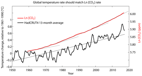
Looking at borehole records and proxy reconstructions (figure 103), it becomes very clear that most of the acceleration in the rate of MGW took place between 1700 and 1900, when very little human-caused GHGs were produced. The rate of warming has changed little in the 20th and 21st centuries, despite the bulk of GHGs being emitted in these past 70 years. However, if the increase in global average temperature over the past 7 decades was mainly a consequence of the rapid increase in CO2, the rate of temperature change should show dependence on the rate of change of the natural logarithm of CO2 concentration. This is because the proposed link between CO2 and temperature is based on a molecular mechanism where every added molecule has slightly less effect than the previous. Even accounting for the logarithmic response of global average temperatures to CO2, the curves for proposed cause and effect are clearly diverging (figure 111). The global temperature anomaly between 1950 and 2017 is not significantly different from a linear trend. On the other hand, atmospheric CO2 increase has been so fast over the 1958-2017 period that the rate of change of its logarithm displays a pronounced acceleration (figure 111).


Figure 111. The difference between temperature increase and CO2 increase. Thick black curve, HadCRUT4 13-month centered moving average surface temperature anomaly, relative to 1961-1990, from 1950 to 2017 (November). Source: UK Met Office. The thin continuous line is a linear trendline of the temperature data. Thick red curve, the natural logarithm of the 1958-2017 annual atmospheric CO2 concentration (ppm). Source: NOAA. Thin black dotted lines, visual aid showing the effect of the rapid increase in CO2 concentration on its logarithm. It is proposed that the increase in the logarithm of CO2 is causing the increase in temperature, yet the curves diverge."

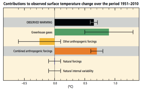
"The lack of MGW acceleration despite the rapid increase in CO2 over the past 7 decades only has two possible explanations. The first is that the ongoing increase in the proposed anthropogenic forcing exactly matches in magnitude and time an ongoing decrease in natural forcing (figure 104). The second is that MGW responds more to natural causes, and only weakly to anthropogenic forcing. The first explanation constitutes an “ad hoc” match of hypothesis to evidence, requires an unrelated coincidence of decadal precision within a multi-century process (natural cooling started just when we started our emissions), and it is disavowed by the IPCC, that considers natural forcing over the 1950-2010 period too small to have contributed to the observed temperature change in any direction (figure 113). That natural forcing has had no role over a 60-year period is hard to believe.


Figure 113. IPCC proposed contributions to observed surface temperature change over the period 1951-2010. IPCC assessed likely ranges (whiskers) and their mid-points (bars) for warming trends over the 1951–2010 period from well-mixed greenhouse gases, other anthropogenic forcings (including the cooling effect of aerosols and the effect of land use change), combined anthropogenic forcings, natural forcings and natural internal climate variability. The observed surface temperature change is shown in black, with the 5 to 95% uncertainty range due to observational uncertainty. The attributed warming ranges (colours) are based on observations combined with climate model simulations, in order to estimate the contribution of individual external forcings to observed warming. Source: IPCC. 2014. AR5. Synthesis Report. Summary for policymakers. Figure SPM.3 p. 6.

The second explanation requires only an insufficient knowledge of the response of the climatic system to CO2, and an insufficient knowledge of natural forcings and climate feedbacks. That our knowledge is insufficient is clear and demonstrated every time the “argumentum ad ignorantiam” that “we don’t know of anything else that could cause the observed warming” is used. New research into solar variability mechanisms (see: Climate change mechanisms) has produced hypotheses that indicate that solar forcing is probably not adequately represented in models, and the cloud feedback is essentially not understood yet."

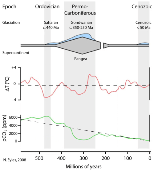
"The CO2 hypothesis proposes that changes in atmospheric CO2 levels are the main driver of Earth temperature changes (Lacis et al., 2010). It is based on the spectral absorption and radiation properties of certain gases, of which water vapor is by far the most abundant, and CO2 is a distant second. Water vapor levels are locally determined and highly variable due to condensation. CO2 levels are global, as it is a well-mixed gas that does not condense, and before industrialization it changed very slowly over time from natural causes. CO2 hypothesis considers that water vapor changes are not the driving factor, but a feedback, proposing without clear evidence that the relevant causal relationship is CO2 –> temperature –> water vapor. Past water vapor levels cannot be determined, but in the distant past, cold periods of the planet (Ice Ages) were associated to lower CO2 levels than warm periods, and this is the supporting evidence offered by proponents of the CO2 hypothesis. The interpretation of this evidence, however, is far from straightforward, as changes in temperature also lead to changes in CO2, from huge ocean carbon dioxide stores, because the gas solubility is dependent on temperature, and in well resolved records, changes in temperature generally precede changes in CO2 by hundreds to thousands of years. Another problem with the hypothesis is that it is generally accepted that a progressive decrease in CO2 levels has taken place for the past 550 million years (the Phanerozoic Eon), from ~ 5000 ppm in the Cambrian to ~ 225 ppm in the Late Pleistocene. This decrease does not appear to have produced a progressive decrease in temperatures, that display a cyclical range-bound oscillation (Eyles, 2008; figure 115), alternating between icehouse and hothouse conditions over the entire Phanerozoic.


Figure 115. Phanerozoic Eon conditions don’t support the CO2 hypothesis. Schematic representation of glacio-epochs during the past 550 million years in Earth history, and their relationship to phases of supercontinent assembly and break up. Glaciations are indicated and represented by the blue area above the scheme. Estimated global temperature trends (red graph), and variations in atmospheric carbon dioxide (green graph), are indicated, with their general trend as a dashed line. Surce: N. Eyles. 2008. Palaeo3 258, 89–129."

Finally, here is a summary of the article as presented below.
The CO2 hypothesis is not new, and can be traced to Arrhenius in 1896, however it did not become the dominant hypothesis to explain temperature changes until the last warming phase of MGW started in the late 1970’s, and temperature and CO2 were both increasing.

In the 20th century, while MGW was taking place, humanity embarked in the ultimate experiment to determine the validity of the CO2 hypothesis and set about to burn huge fossil fuel natural stores while industrializing, to raise CO2 levels beyond what the world has had in perhaps millions of years. After 70 years with CO2 levels increasing faster than ever recorded, and above any previously recorded level for the Late Pleistocene, it is time to analyze the results.

  1. The world has continued warming as before. The warming during the 1975-1998 (or 1975-2009) period is not statistically significantly different from the warming during the 1910-1940 period (Jones, 2010).
  2. The temperature increase since 1950 shows no discernible acceleration and can be fitted to a linear increase. The logarithm of the CO2 increase, however, displays a very clear acceleration (figure 111). A linear relation between supposed cause and effect cannot be established.
  3. Sea level has continued rising as before. Its acceleration is not responding perceptibly to the increase in anthropogenic forcing (figure 114).
  4. The cryosphere shows a non-cyclical retreat in glacier extent with evidence of acceleration (figure 107; Zemp et al., 2015). The reduction of the size of ice shelves is also unusual (figure 109). The evidence supports a cryosphere response to the CO2 increase.
  5. Despite CO2 levels that are almost double the Late Pleistocene average, the climatic response is subdued, still within Holocene variability, below the Holocene Climatic Optimum and below warmer interglacials.
Lack of support for the CO2 hypothesis from Antarctic ice cores (figure 110), and from results 1-3 has forced the proponents of the hypothesis to make numerous new unsupported assumptions. They assume that all warming since 1950 is anthropogenic in nature (IPCC-AR5, 2014, figure 113). That past recorded temperatures must be cooler than previously thought (Karl et al., 2015). That the oceans (Chen & Tung, 2014), and volcanic eruptions (Fasullo et al., 2016), are delaying the surface warming and SLR. And essentially concluding that more time is required to observe the warming and SLR acceleration. All these might be true, but the simplest explanation (Occam’s favorite) is that an important part of the warming is due to natural causes, and CO2 only has a weak effect on temperatures. If after 70 years of extremely unusual CO2 levels, a lot more time is required to see substantive effects, then the hypothesis needs to be changed. As proposed it does not call for long delays, due to the near instantaneous effect of the atmospheric response to more CO2. The CO2 hypothesis is at its core an atmospheric-driven hypothesis of climate. There is a significant possibility however that the climate is actually ocean-driven, directly forced by the Sun, and mediated by H2O changes of state.

The high sensitivity of the cryosphere to the CO2 increase might actually be an argument for a reduced sensitivity by the rest of the planet. The air above the cryosphere is the coldest of the planet, as it is not warmed much from below, and therefore it has the lowest humidity of the planet. The ratio of water vapor to CO2 in the air above the cryosphere is the lowest and the one that changes the most with the increase in CO2. There is the possibility that air dryness, and the low capacity to produce water vapor in response to warming might be the reasons why the cryosphere is particularly sensitive to CO2, but it implies the rest of the planet is less sensitive. If CO2 sensitivity is highest over the cryosphere (except Antarctica), and lower over the rest of the planet, this points to a negative feedback by H2O response, in its three states, to temperature changes. Antarctica doesn’t show increased sensitivity because it has not been warming through the entire MGW, regardless of CO2.

There are multiple possible H2O temperature regulatory mechanisms, and the proposition that H2O only acts as a fast-positive feedback to CO2 changes is too simplistic. The huge water mass in Earth’s oceans and its slow mixing, add a great thermal inertia that resists temperature changes. Atmospheric humidity determines how changes in energy translate into changes in temperature, as humid air has a higher heat capacity and responds to the same energy change with a lower temperature change than dry air. Atmospheric humidity responds very fast to temperature changes through evaporation and condensation. This mechanism is proportional to water availability, and works better above the oceans than over land, and very little over the cryosphere, inversely correlating to MGW temperature changes, that are highest in the Arctic (polar amplification), and lower over the oceans than over land. To that we must add other region-specific temperature-regulating mechanisms by H2O. Deep convection is a tropical atmospheric phenomenon that takes place when the surface of the tropical ocean reaches 26-30 °C. The ocean flips from absorbing energy to releasing it, and convection takes the energy very high in the troposphere, cooling the ocean (Sud et al., 1999) and effectively limiting its maximum temperature. Polar sea ice is a negative feedback that releases heat when it forms in the autumn, then absorbs heat, when it melts in spring, and it acts as an insulator preventing ocean heat loss during winter. Ice-albedo effect is a positive feedback, in that a decrease in ice reduces albedo, driving further ice loss. But ice-albedo feedback is ameliorated because ice extent moves opposite to sunlight (maximum ice coincides with minimum albedo when it is darker), and by the high inclination of the Sun’s rays at polar latitudes, making water more reflective. So the albedo effect is not driving Arctic sea ice melting as demonstrated by the 10-year pause in summer Arctic sea ice loss, after losing 30% of its extent the previous 10-year period.

Due to its huge thermal inertia, changes in its three states, cloud condensation, humidity regulation, and effective saturation of IR absorption, H2O is a good candidate to explain the observed resistance of planetary temperatures to increasing CO2 forcing. Only in the cryosphere, where humidity is very low and sublimation a very ineffective change of state, CO2 increase, helped by the albedo effect, is likely driving a non-cyclical melting that affects sea level rise.

Conclusions

1) Modern Global Warming is one of several multi-centennial warming periods that have taken place in the last 3000 years.

2) Holocene climate cycles project that the period 1600-2100 AD should be a period of warming.

3) A consilience of evidence supports that Modern Global Warming is within Holocene variability.

4) Modern Global Warming displays an unusual non-cyclical cryosphere retreat. The contraction appears to have undone most of the Neoglacial advance.

5) The last quarter (70 yr) of Modern Global Warming is characterized by extremely unusual and fast rising, very high CO2 levels, higher than at any time during the Late Pleistocene. This increase in CO2 is human caused.

6) The increase in temperatures over the past 120 years shows no perceptible acceleration, and contrasts with the accelerating CO2 forcing.

7) Sea level has been increasing for the past 200 years, and its modest acceleration for over a century shows no perceptible response for the last decades to strongly accelerating anthropogenic forcing.

8) The evidence supports a higher sensitivity to increased CO2 in the cryosphere, which is driving unusual melting and a small long-term sea level rise acceleration. The rest of the planet shows a lower sensitivity, indicating a negative feedback by H2O, that prevents CO2 from having the same effect elsewhere.

For additional reading of the entire data analyzed see here. https://judithcurry.com/2018/02/26/nature-unbound-viii-modern-global-warming/
 
Has anyone ever considered that ocean rise could be attributed to all the junk, crap, stuff that gets dumped in there? Think about the sunken ships, plane wreckage debris, junk, heck some nations have made their own islands by dumping soil into the ocean, not too mention all the vessels on ocean waters...... ok I say this in jest but I would add: Global warming can be a heated (no pun intended) topic and for the most part the debate in here, while strong emotions at times, is very civil and for that I say thank you!

Sent from my SM-G920V using Tapatalk
*face palm*
 
I guess it shouldn't come to any surprise that the climate4you site is run by denier Dr Ole Humlum, who proposed that the sun and the moon explain most of earth's current climate change (lol), that the CO2 increases we're seeing today were natural (facepalm), and the earth would cool significantly between 2013 and 2030 (not looking good there either). Let's also keep in mind he works for the Academic Advisory Council of the Global Warming Policy Foundation, a think tank whose sole intention is to question and spread misinformation on climate change. Sigh...

The only data I posted from his website is the HadCRUT4 graph and the 6 stations above 60N. I linked to and provided graphs straight from the GISS site in a follow up response for 5 out of the 6 stations which shows the data I posted was not manipulated by Dr Ole Humlum... and I also never cited those opinions of his you mention above or said I agree with his views.
 
I can't thank you enough for wanting to keep this civil and sticking to the topic here. I really appreciate it, this is the kind of discussion I was hoping we'd continue to have.

"I think the data posted shows that prior to 2005, the 1990s and early 2000s have experienced similar levels of warmth as that seen in the 1920-45 period and post 2005"
"...stating the 2000s are warmer than the 1930s isn't entirely accurate"

If it was me, I wouldn't make that claim unless you're willing to show how every major dataset is wrong in showing the late 1990s and early 2000s being warmer than 1920-1945 in the arctic, that includes but is not limited to:
HADCRUT4 (filled cowtan/way)
Berkley
GISTEMP (GISS)
ERA-20C
CERA-20C
NOAA's 20th Century version 2
NOAA's 20th Century version 2c

See for yourself here, I'm not going to post a bajillion images on this forum, that would be a waste of everyone's time and blog space.
https://www.esrl.noaa.gov/psd/cgi-bin/data/testdap/plot.comp.pl

As for CO2 relationship to global temperature, yes the relationship is non-linear and generally lograthmic because each subsequent addition of CO2 saturates the IR wavelengths but the scaling of that Y axis of that graph showing the relationship between CO2 and temperature is capable of being highly misleading, you need to make sure scale the [CO2] and temperature to non-dimensional values because their variances aren't the same and that matters when you're assessing their correlations, if the authors of the graph stretched the y-dimension more, the correlation to CO2 would decrease some and vis versa.


".I pulled the graphics straight from the GISS website and used the option to remove only suspicious records from the data. I think the GISS graphs I posted indicate the warming even recently isn't unprecedented for most of the stations"

I would agree on the premise that the GISS dataset is probably not the most trustworthy it's not my favorite. but for a majority of stations, especially those on the Canadian, Greenland, Atlantic, and Pacific sides of the arctic, the current warming isn't matched for the most recent decade or so in the observational record is unmatched, Eurasia is a different animal for other reasons that are related to regional circulation changes attributable to both natural and anthropogenic forcing.

"solar forcing is probably not adequately represented in models, and the cloud feedback is essentially not understood yet."

Yes, that's definitely right in that the feedbacks are poorly represented in the models and I believe once we understand the solar connection to the climate, which is highly convoluted below the mesosphere, we'll likely increase forecast lead times especially for major modes of climate variability like ENSO and there's some research I've come across (even from NASA) that suggests gravitational interactions w/ the planets peturbing the solar dynamo and implicating overall output. Unfortunately solar's direct, radiative effect on the climate is modest in comparison to the cumulative forcing from GHGs, however we likely don't understand the secondary impacts from UV radiation for example and how those circulation anomalies generated by differential photo dissociation of ozone in the stratosphere propagate into the troposphere (this portion is most certainly not represented in NWP, you don't have to look much further than to SSW event forecast we see around mid-late winter in most seasons). I think the overall effect from solar on the climate (not just saying this in terms of temperature) may be larger than most give it credit for, but I'm not convinced solar is the answer here. I'm watching and waiting to see how the climate system responds to solar cycle 24 and 25, I would venture to guess ENSO harmonics will broaden (more multi-year NINO events for example) and we may be able to offset some (but not all) of the stratospheric cooling and Hadley Cell Expansion (which is also not represented adequately in models, go figure) that's been at least somewhat attributable to GHG forcing.


Wrt to the lack of temperature response to CO2, the climate system has a profound amount of thermal inertia, especially when it comes to the deep ocean, but the current global warming is much faster than most periods in the Holocene and again that's due in part to GHGs, as for temperature records before the 19th century suggesting the warming accelerated even more so than the present day, I probably wouldn't go that far either except in areas like Europe and the North Atlantic where we had regular ship traffic and some instrumentation, otherwise proxy records would be needed.

As for the last passage:
"The temperature increase since 1950 shows no discernible acceleration and can be fitted to a linear increase."

Ehh not quite, fitting a linear trend line from 1977 onward would indeed be close to observed temperatures but due to the cooling in the 1960s & 70s, this is a pretty clear reach to say there's been no acceleration since 1950 because, again the globe was cooling at the beginning of the period.

"The ratio of water vapor to CO2 in the air above the cryosphere is the lowest and the one that changes the most with the increase in CO2. There is the possibility that air dryness, and the low capacity to produce water vapor in response to warming might be the reasons why the cryosphere is particularly sensitive to CO2, but it implies the rest of the planet is less sensitive. If CO2 sensitivity is highest over the cryosphere (except Antarctica), and lower over the rest of the planet, this points to a negative feedback by H2O response, in its three states, to temperature changes. Antarctica doesn’t show increased sensitivity because it has not been warming through the entire MGW, regardless of CO2."

The first bolded statement is correct, this is what we observe both in observations and proxy records, and makes sense generally speaking, because the moist static energy budget is higher in the tropics and subtropics we warm/cool less appreciably than the polar regions. In fact, during periods of earth's history where the climate was very warm (Cretaceous for example), the tropics only warmed a degree or two from their present day values.

The last statement can likely be easily explained by a discussion I had earlier on this forum wherein human release of CFCs in the mid 20th century destroyed copious amounts of ozone and because there isn't much topography to create Rossby Waves that mix ozone rich tropical and subtropical air into the polar regions, the Antarctic vortex is more isolated than the northern vortex, thus the ozone hole is more prominent here. The cooler stratospheric temperatures and circulation anomalies generated from this change in the thermal wind, which leads to a stronger Antarctic vortex, descend into the troposphere and create a +AAO, favoring sea ice accrual or less loss of mass. This is likely why the Antarctic is responding differently from the rest of the globe, as the ozone hole recovers there in the coming decades, it's plausible to assume that sea ice loss will begin in earnest.
 
Last edited:
The only data I posted from his website is the HadCRUT4 graph and the 6 stations above 60N. I linked to and provided graphs straight from the GISS site in a follow up response for 5 out of the 6 stations which shows the data I posted was not manipulated by Dr Ole Humlum... and I also never cited those opinions of his you mention above or said I agree with his views.

That particular data was not manipulated by Dr Humlum but I'm making you and others well aware that he has an agenda against AGW and a history of trouble, especially with his GISP2 ice core graph that he purposely failed to update (which showed more warming) until he received enough of an outcry from the scientific community to update it.
 
A really cool paper just came out in Nature talking about a Solar Storm in 774 recorded in tree rings and the carbon-14 generation during and immediately after this event. A major solar storm like this if it occurred in our lifetimes, would definitely have ramifications on our winter esp for that year and even interannual variability.
https://www.nature.com/articles/s41467-018-05883-1
 
"I think the data posted shows that prior to 2005, the 1990s and early 2000s have experienced similar levels of warmth as that seen in the 1920-45 period and post 2005"
"...stating the 2000s are warmer than the 1930s isn't entirely accurate"
If it was me, I wouldn't make that claim unless you're willing to show how every major dataset is wrong in showing the late 1990s and early 2000s being warmer than 1920-1945 in the arctic, that includes but is not limited to:
HADCRUT4 (filled cowtan/way)
Berkley
GISTEMP (GISS)
ERA-20C
CERA-20C
NOAA's 20th Century version 2
NOAA's 20th Century version 2c

See for yourself here, I'm not going to post a bajillion images on this forum, that would be a waste of everyone's time and blog space.
https://www.esrl.noaa.gov/psd/cgi-bin/data/testdap/plot.comp.pl

Based on this graph posted on the previous page, the two circled regions are remarkably similar in magnitude. Only 3 of the datasets here go back to the 1940 period. It's hard to tell where exactly the GIS, ERA20C and Berkeley temps are in the late 90s to early 2000s but the Berkeley dataset is similar, ERA20C appears to be a little warmer for 1 year but similar the other years and GIS appears similar as well. The IPCC and several other sources I cited also mentioned the warmth as comparable so I think there is enough data there to make this claim while also realizing that due to uncertainty with dataset bias and limited records/coverage in the 1930s and 40s the numbers could have been either higher or lower. We might just have to agree to disagree on this one :)
Graph.png

As for CO2 relationship to global temperature, yes the relationship is non-linear and generally lograthmic because each subsequent addition of CO2 saturates the IR wavelengths but the scaling of that Y axis of that graph showing the relationship between CO2 and temperature is capable of being highly misleading, you need to make sure scale the [CO2] and temperature to non-dimensional values because their variances aren't the same and that matters when you're assessing their correlations, if the authors of the graph stretched the y-dimension more, the correlation to CO2 would decrease some and vis versa.

That's a fair point and the authors do not mention the methodology behind this image so it would be difficult to determine without contacting them for clarification.

".I pulled the graphics straight from the GISS website and used the option to remove only suspicious records from the data. I think the GISS graphs I posted indicate the warming even recently isn't unprecedented for most of the stations"
I would agree on the premise that the GISS dataset is probably not the most trustworthy it's not my favorite. but for a majority of stations, especially those on the Canadian, Greenland, Atlantic, and Pacific sides of the arctic, the current warming isn't matched for the most recent decade or so in the observational record is unmatched, Eurasia is a different animal for other reasons that are related to regional circulation changes attributable to both natural and anthropogenic forcing.

For the 5 locations I pulled from GISS, some of the locations exhibited some warmer conditions recently whereas some like Nuuk have remained fairly constant. These weren't intended to be representative of the entire Arctic though, only to look at some long standing observational records and how they have changed over a long period of time.

"solar forcing is probably not adequately represented in models, and the cloud feedback is essentially not understood yet."
Yes, that's definitely right in that the feedbacks are poorly represented in the models and I believe once we understand the solar connection to the climate, which is highly convoluted below the mesosphere, we'll likely increase forecast lead times especially for major modes of climate variability like ENSO and there's some research I've come across (even from NASA) that suggests gravitational interactions w/ the planets peturbing the solar dynamo and implicating overall output. Unfortunately solar's direct, radiative effect on the climate is modest in comparison to the cumulative forcing from GHGs, however we likely don't understand the secondary impacts from UV radiation for example and how those circulation anomalies generated by differential photo dissociation of ozone in the stratosphere propagate into the troposphere (this portion is most certainly not represented in NWP, you don't have to look much further than to SSW event forecast we see around mid-late winter in most seasons). I think the overall effect from solar on the climate (not just saying this in terms of temperature) may be larger than most give it credit for, but I'm not convinced solar is the answer here. I'm watching and waiting to see how the climate system responds to solar cycle 24 and 25, I would venture to guess ENSO harmonics will broaden (more multi-year NINO events for example) and we may be able to offset some (but not all) of the stratospheric cooling and Hadley Cell Expansion (which is also not represented adequately in models, go figure) that's been at least somewhat attributable to GHG forcing.

Solar cycles 24 and 25 will be interesting to watch unfold as will the upcoming minimum, if indeed it occurs as projected. I have no doubt there will be some interesting papers examining the data as time goes on and we learn more about solar forcing and other feedback mechanisms that we currently don't understand at all or know little about.

Wrt to the lack of temperature response to CO2, the climate system has a profound amount of thermal inertia, especially when it comes to the deep ocean, but the current global warming is much faster than most periods in the Holocene and again that's due in part to GHGs, as for temperature records before the 19th century suggesting the warming accelerated even more so than the present day, I probably wouldn't go that far either except in areas like Europe and the North Atlantic where we had regular ship traffic and some instrumentation, otherwise proxy records would be needed.

As mentioned from the article, "Another problem with the hypothesis is that it is generally accepted that a progressive decrease in CO2 levels has taken place for the past 550 million years (the Phanerozoic Eon), from ~ 5000 ppm in the Cambrian to ~ 225 ppm in the Late Pleistocene. This decrease does not appear to have produced a progressive decrease in temperatures, that display a cyclical range-bound oscillation (Eyles, 2008; figure 115), alternating between icehouse and hothouse conditions over the entire Phanerozoic."
figure-115.png


For example on the graph above the coldest period occurred during the highest CO2 concentrations with around 6,000ppm. There are difficulties involved with estimating the CO2 concentrations due to various properties and such but assuming the data above is accurate then it provides a good starting point to figuring out what caused such a dramatic cooling when CO2 levels were so high. What are your thoughts?


"The ratio of water vapor to CO2 in the air above the cryosphere is the lowest and the one that changes the most with the increase in CO2. There is the possibility that air dryness, and the low capacity to produce water vapor in response to warming might be the reasons why the cryosphere is particularly sensitive to CO2, but it implies the rest of the planet is less sensitive. If CO2 sensitivity is highest over the cryosphere (except Antarctica), and lower over the rest of the planet, this points to a negative feedback by H2O response, in its three states, to temperature changes. Antarctica doesn’t show increased sensitivity because it has not been warming through the entire MGW, regardless of CO2."
The first bolded statement is correct, this is what we observe both in observations and proxy records, and makes sense generally speaking, because the moist static energy budget is higher in the tropics and subtropics we warm/cool less appreciably than the polar regions. In fact, during periods of earth's history where the climate was very warm (Cretaceous for example), the tropics only warmed a degree or two from their present day values.
The last statement can likely be easily explained by a discussion I had earlier on this forum wherein human release of CFCs in the mid 20th century destroyed copious amounts of ozone and because there isn't much topography to create Rossby Waves that mix ozone rich tropical and subtropical air into the polar regions, the Antarctic vortex is more isolated than the northern vortex, thus the ozone hole is more prominent here. The cooler stratospheric temperatures and circulation anomalies generated from this change in the thermal wind, which leads to a stronger Antarctic vortex, descend into the troposphere and create a +AAO, favoring sea ice accrual or less loss of mass. This is likely why the Antarctic is responding differently from the rest of the globe, as the ozone hole recovers there in the coming decades, it's plausible to assume that sea ice loss will begin in earnest.

Only time will tell if your theory is correct on this or not. There are alternative views on this as well and it is a debated issue so it's not likely we will reach an agreement or consensus on this one :)
 
"Based on this graph posted on the previous page, the two circled regions are remarkably similar in magnitude. Only 3 of the datasets here go back to the 1940 period. It's hard to tell where exactly the GIS, ERA20C and Berkeley temps are in the late 90s to early 2000s but the Berkeley dataset is similar, ERA20C appears to be a little warmer for 1 year but similar the other years and GIS appears similar as well. The IPCC and several other sources I cited also mentioned the warmth as comparable so I think there is enough data there to make this claim while also realizing that due to uncertainty with dataset bias and limited records/coverage in the 1930s and 40s the numbers could have been either higher or lower. We might just have to agree to disagree on this one"

I didn't want to have to do this because I thought you could see this for yourself in the link I sent, so here comes a ton of maps. Here's what those datasets show for the period centered on the peak of the warming spike in 1940 (give or take 5 years) vs 1998-2004.

NOAA 20CRv2 (1998-2004) vs (1935-1944), 1998-2004 is significantly warmer in the arctic.
5Bg0QabLNH.png

NOAA's 20th Century Reanalysis Version 2c 1998-2004) vs (1935-1944), 1998-2004 is also significantly warmer in the arctic.

5Bg0QabLNH.png

1998-2004 is also warmer in CERA-20C.
ncl5bsiMhkVDm.tmpqq.png
nclX_1cHJXmUU.tmpqq.png


1998-2004 is also warmer than 1935-1944 in GISTEMP (GISS)
nclytCrHOWHlZ.tmpqq.png
nclYQlgpn_4Q5.tmpqq.png


Now look at HADCRUT4. This is exactly what I've been trying to explain to you for a few days, but maybe you'll finally see what I'm saying now. HADCRUT4 doesn't use any interpolation and most of the data in these grid boxes that are filled contain one or a few stations except in the US and Europe, and perhaps the Atlantic. This means there's a ton of missing data over the arctic, and the climate4you graph only averages the data that's been filled, all the gray area that's missing doesn't count towards the average. Hence, it's hard to even make any substantial claim or determination from this dataset alone when 2/3rds of the arctic is missing in the 1930s & 40s. Not even a shadow of doubt the subpolar regions are significantly warmer however.

nclkMCLjLtS9Y.tmpqq.png nclfTqG_sf8YX.tmpqq.png


You should get my point now, 1998-2004 is warmer than 1935-1944 in the arctic in virtually all of these datasets. Could 1935-1944 be warmer though? Possibly, it's within the margin of error, but it's more likely to have been cooler than the late 1990s & early 2000s.
 
Last edited:
I read an article saying that temps in the tropics where as high as 61 C during the Cretaceous and water temps as high as 42 C.


Sent from my iPhone using Tapatalk
 
Last edited:
I read an article saying that temps in the tropics where as high as 61 C during the Cretaceous and water temps as high as 42 C.


Sent from my iPhone using Tapatalk

Yeah water temperatures even at the bottom of the deepest portions of the oceans were lukewarm and tropical fauna was found at the north and south poles. The creation of the Himalayas and isolation of Antarctica from Australia eventually spiraled us into a large-scale ice age thereafter
 
Status
Not open for further replies.
Back
Top