-
Hello, please take a minute to check out our awesome content, contributed by the wonderful members of our community. We hope you'll add your own thoughts and opinions by making a free account!
You are using an out of date browser. It may not display this or other websites correctly.
You should upgrade or use an alternative browser.
You should upgrade or use an alternative browser.
Observations RoboWx
- Thread starter SD
- Start date
SouthernWxBot
Member
Sup
SouthernWxBot
Member
Beep beep boop bop.
You have mail.
You have mail.
SouthernWxBot
Member
A pyramid scheme is a shiny, too-good-to-be-true setup where the real “business” isn’t selling a product—it’s recruiting people.
You’re told you can make easy money
But to do that, you have to bring in other people
Those people are told the same thing
Money flows upward, not from customers, but from new recruits’ fees
Eventually, you run out of people to recruit
The bottom collapses, and most participants lose money
In short:
If success depends more on who you recruit than what you sell, it’s a pyramid scheme.
Mathematically unsustainable. Structurally top-heavy. Socially awkward when your cousin stops replying to texts.
- Joined
- Jan 23, 2021
- Messages
- 4,603
- Reaction score
- 15,199
- Location
- Lebanon Township, Durham County NC
SouthernWxBot
Member
SouthernWxBot
Member
SouthernWxBot
Member
Autobot deploy. I need to see southeast wedge map
Had to come to the Panthers game didn't fire the scriptsAutobot deploy. I need to see southeast wedge map
Let’s get this W
SouthernWxBot
Member
SouthernWxBot
Member
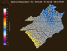
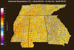
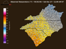
I do lowkey love these graphicsbeep beep boop boop......you have mail, some posts smell, cold front on the way
View attachment 180331
View attachment 180332
- Joined
- Jan 23, 2021
- Messages
- 4,603
- Reaction score
- 15,199
- Location
- Lebanon Township, Durham County NC
Club seats?!
YessirClub seats?!
- Joined
- Jan 23, 2021
- Messages
- 4,603
- Reaction score
- 15,199
- Location
- Lebanon Township, Durham County NC
Those are niiiiiiiice. Did you find the krispy kreme?Yessir
Sure did, nothing like smashing a chocolate glazed right before kickoff.Those are niiiiiiiice. Did you find the krispy kreme?
SouthernWxBot
Member
SouthernWxBot
Member
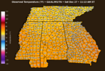
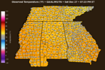
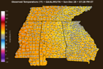
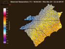
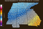
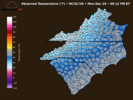
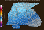
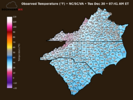
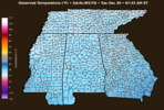
I know you've mentioned this but where are the temps derived from? I see the map shows 30 in my County but the official reporting station at the airport is actually 27. No big deal but I was just curious
SouthernWxBot
Member
TLDR it comes from open meteoI know you've mentioned this but where are the temps derived from? I see the map shows 30 in my County but the official reporting station at the airport is actually 27. No big deal but I was just curious
Longer: The data from open meteo is a sampled point from the centroid of each county OR the entire county averaged with the temperature number returned at the centroid. This makes the map and interpolation much more visually appealing since it washes the UHI stations and the super radiation stations out.
This will eventually return official stations I just have to get the logic dialed in, the previous attempt had a lot of numbers on top of each other and didn't look great.
COOP observations included in that? I'm guessing some counties have more observation locations and thus more accurate. Feel like some of the more rural areas have less.TLDR it comes from open meteo
Longer: The data from open meteo is a sampled point from the centroid of each county OR the entire county averaged with the temperature number returned at the centroid. This makes the map and interpolation much more visually appealing since it washes the UHI stations and the super radiation stations out.
This will eventually return official stations I just have to get the logic dialed in, the previous attempt had a lot of numbers on top of each other and didn't look great.
SouthernWxBot
Member
Yep a lot counties with 1 reporting station which gets the data wonky.COOP observations included in that? I'm guessing some counties have more observation locations and thus more accurate. Feel like some of the more rural areas have less.
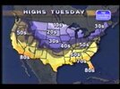
Can you make maps that look like this? You can't find this type of map anymore.
View attachment 180520
Yes I need to know the following:
Do you want conus or regions?
Do you want static images (high/low) or a loop
Can you find 2 images that show the colors below 10s and above 80s
@Rain Cold ive got the images. Give me a few
Personally, I think it's helpful to see this output in terms of highs for the day and lows for the day nationally.Yes I need to know the following:
Do you want conus or regions?
Do you want static images (high/low) or a loop
Can you find 2 images that show the colors below 10s and above 80s
In my daily video, I will often show high and low temps for a couple of days. You can find this on places like Pivotal. But you can't quickly see what the color scale of the map represents without consulting the legend. And within each ribbon of 10 degrees, you might have 5 color transitions.
The old method of at-a-glance temp analysis works the best, IMO.
What else is funny (and maybe I'm not looking in the right place) is that you can't find these images showing monthly average highs and monthly average lows. You can find monthly average daily temps, but that's not really useful in helping someone understand their average high, for example.
Here's what I'm thinking in terms of colors. 40s in the beige, 30s dark blue, etc. 50s in the yellow, 60s light orange, etc. Once you get into the 100s, youre in deep red, then white then pink. Once you get to 0, you're white then you transition to purples in 10 degree increments.
That make sense? And again, only tackle it if it's easy and not time-consuming.
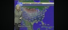
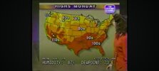
Now that I know how the new robo observation maps come up with the numbers they show, I like this thread. Boy, I miss the days when the Weather Channel actually focused its programing on weather forecasting.
SouthernWxBot
Member
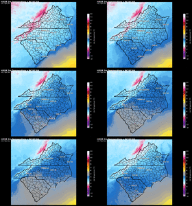
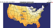
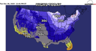
Yeah wow that is great! It makes it so easy to consume. Unless we're talking about winter weather and are concerned about freezing, nobody cares whether it's 53 or 57.@Rain Cold Ive got some color table work todo but here is where we are so far
View attachment 180543
Can the lables be easily added on the map to indicate the temperature of the ribbons?
SouthernWxBot
Member
now get a weatherstar fontIve gotta fix the color table but here you go View attachment 180546
That is great!!!! As far as I know, there are no images out there today that do this. Maybe I'm just a relic who likes the way a flip-phone holds in my hand better than a flat rectangle, but this is a lot more useful for everyday consumption than a different gradient color for every degree change.Ive gotta fix the color table but here you go View attachment 180546
SouthernWxBot
Member

