• Hello, please take a minute to check out our awesome content, contributed by the wonderful members of our community. We hope you'll add your own thoughts and opinions by making a free account!

Who wants to be my teacher?

KellynaMoon

Member
Joined
Nov 28, 2022
Messages
16
Reaction score
43
Location
McCalla
I’ve been a weather nerd since the dawn of time (not really but since 2000). I know how to read radar (that’s pretty obvious), and am ok at being able to decipher severe threat potential on long range models (for fun, again obviously things change when you get closer). I bounce in and out of the forums, use the wx hashtags on twitter, but I can not grasp the forecast soundings. People have tried to explain it and it just doesn’t go into my brain. Again, I just do this for fun as a hobby since I live in Alabama and we are a magnet for severe weather. I don’t make posts anywhere hyping things or for attention/likes. I just do this for myself because I love it but am too terrible at math to have a degree in it. Does anyone want to adopt me and tell me like a toddler? I would like to be able to contribute more to this forum. Thank you!

Also if this kind of post isn’t allowed, feel free to delete it or tell me to delete it. Whichever.
 
I'd be happy to help you. I would send you a private message, but I think it's best to do it on the public forum so others may also learn something. What questions do you have specifically, or what concepts do you want to be explained? I see you said you cannot grasp soundings, so I'll give a little primer on those. My strengths are NWP (numerical weather prediction.. so weather models) and severe weather forecasting.

What is a sounding exactly?
A sounding profile is simply a vertical profile of the atmosphere. When a meteorologist releases a weather balloon, it rises into the atmosphere and records various bits of data at each level (temperature, dewpoint, winds, etc). The raw data is fed back to the NWS who has software that automatically plots this data onto the sounding profile. Models also forecast that data at many vertical levels, so it's now possible to see a simulated forecast sounding generated by software that can translate the raw model data into the graph.

How do you read a sounding?
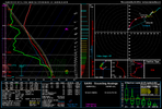
I'll use the most common sounding profile nowadays which is generated by a software called sharppy (pic below.. this is a sounding from Tuscaloosa AL before their EF-4 tornado on April 27, 2011.. so a classic "perfect" significant tornado sounding).
1673126234387.png

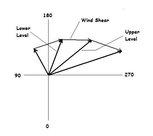
I'll first call your attention to the main panel on the top left with the vertical green and red lines. The red line depicts the vertical temperature profile, the green line depicts dewpoint. The temperatures along the x axis are skewed (this, as most soundings, is called a skew-t), so to find a line of equal temperature, it's the lines that are in the background that extend from the number on the x-axis up to the up/right. For example, look at the 0 on the x axis, and follow the thin dark blue line that extends from right above that 0 up thru the green and red lines and to the top right of the panel. That line indicates 0 degrees Celsius. So where that line intersects the red line, the temperature is 0 degrees C at that level, and where that line intersects the green line, the temperature is 0 degrees C at that level. Each temperature level (from -50 to 50 C) does the same thing. The curved white dotted line to the right of the vertical red line is a simulated/theoretical parcel of air that is lifted into the atmosphere. The parcel is a theoretical concept.. just think of rising air and the temperature of that air as it rises. In order to get a cloud, you need moist air to rise and condense, so you want the parcel to be warmer than the environmental air surrounding it. The gap between the red line (environmental temperature) and the white curved line (theoretical parcel temperature) is called CAPE, which you've probably seen depicted on maps. SBCAPE means that the theoretical parcel originated at the surface. The more cape you have, the more a parcel of air will continue to lift in the atmosphere. In fact, as long as there is a gap between the red line (environmental temperature) and white line (theoretical parcel), the parcel will continue to rise in the atmosphere on it's own, all the way until those lines meet which is called the equilibrium level. The white numbers on the vertical/Y axis, on the left side, are pressure levels (1000 = 1000mb, 850 = 850mb,, etc).. The larger the overall gap between the red line and white line, the more CAPE you have. In the sounding in the picture, the cape region is nice and fat, and if you look below you'll see that surface-based CAPE is over 3000, indicating a very unstable atmosphere! You also typically want the red line to be more tilted/more sloped as that would indicate faster cooling with altitude (this is called steep lapse rates) which can help with instability. There are some other things on this panel which aren't that important for a basic understanding or application. The wind barbs on the right side of the panel indicate wind speed/direction at each vertical level depicted. Now, on the top right there is another panel that looks like a + with circles around it and a multi-colored squiggly line. This is called a hodograph. The hodograph is a depiction of wind speed and direction at each vertical level, mapped as a line. Each vertical point is plotted on the hodograph as a vector. Vector may sound scary but they're very simple. The farther away the point is from the center, the stronger the wind speed is at that level.. and the arrow (on the picture below) is pointed in the direction that the wind is blowing at that level. The hodograph on the sounding doesn't have the arrows, just a line connecting the points at the end of those arrows. Hodographs are helpful in depicting wind shear and helicity. The "fatter" or wider the hodograph line, the more wind shear or helicity you probably have. If the line is rather straight and short, you may not have much shear. If the line is big and curved, you likely have strong wind shear and helicity (which are different btw). In the sounding I put up above, the wind shear and helicity are very strong and it is characterized by a big curved hodograph line. See the red line on the hodograph is large and curved. The "storm slinky" below the hodograph isn't too important IMO, I don't use it much. It essentially combines the theoretical air parcel (or updraft) with the wind profile to depict a theoretical updraft "shape". You typically want it to be curved or kidney-bean shaped, like the one in the sounding above is.
hodo.jpg

The Psbl Haz Type is over-used and is simply a combination of parameters, I advice against using it. I know seeing "PDS TOR" can be exciting, but it doesn't mean much other than that some parameters are high. The parameters at the bottom of the sounding are all derived from the thermodynamic (temperature/moisture/skew-t panel top left) and hodograph wind profile. CAPE is instability, gap between the raised parcel and environmental temperature, as explained earlier. CINH is the opposite of cape, it's when the red line (temperature) is on the right side of the theoretical parcel temperature, indicating that the environmnetal temperature is warmer than the parcel.. this would cause the parcel to sink instead of rise. LCL Is the level at which the humidity is close to 100%, typically where a cloud would begin to form (so the cloud's base height in meters). LI is lifted index, another measure of instability similar to cape (lower is better for LI). LFC Is level of free convection, it's the level at which a parcel can freely rise without needing any other catalyst pushing it up. EL is equilibrium level, where the parcel temp and environmental temp are equal, in meters. For naders, you want LFC and LCL to be low. (LCL below 1200m, LFC below 2400m). To the right are wind-based parameters. SRH Is storm relative helicity, which is essentially how much spin a parcel has before it's lifted into a storm.. a bit of a complicated parameter, but can be helpful in determining tornado threat, especially low level SRH and especially VERY low level SRH (such as from the surface to 100m or 500m!) You want a spinning updraft, and with enough SRH you get that. You typically want >100 0-100m SRH, >200 0-1km SRH, >300 0-3km SRH). On the sounding above, the SRH is extremely high at all levels, indicating a great tornado threat. Shear is the change in wind speed and direction with height, measured in kts by a vector difference equation. the analog system isn't that helpful, but it lists events of supercells and hail which had "similar" looking soundings.


I know this is a lot, if you have any questions about any of that, feel free to ask. I know it can be confusing at first, but it's all pretty basic stuff. Remember, severe storm and tornado forecasting involves MUCH more than just looking at forecast soundings. In fact, nowadays I don't look at soundings that much outside of tornado research.
 
I’ve been a weather nerd since the dawn of time (not really but since 2000). I know how to read radar (that’s pretty obvious), and am ok at being able to decipher severe threat potential on long range models (for fun, again obviously things change when you get closer). I bounce in and out of the forums, use the wx hashtags on twitter, but I can not grasp the forecast soundings. People have tried to explain it and it just doesn’t go into my brain. Again, I just do this for fun as a hobby since I live in Alabama and we are a magnet for severe weather. I don’t make posts anywhere hyping things or for attention/likes. I just do this for myself because I love it but am too terrible at math to have a degree in it. Does anyone want to adopt me and tell me like a toddler? I would like to be able to contribute more to this forum. Thank you!

Also if this kind of post isn’t allowed, feel free to delete it or tell me to delete it. Whichever.
You can always ask question when you see something posted you don’t understand or don’t know how to read. I do it all the time. We are all here to learn..
 
I would also like to note that I was only a few miles from the April 27th Tuscaloosa tornado when it went down. Me and my newborn (at the time) hid in a bomb shelter on the UA while my parents and siblings were at the mall (yes the mall in the background of the infamous video the guy shot from the mall parking lot of that tornado). So many come here, but most people generally only think of that one when they think of Tuscaloosa. I would like to think me panic calling everyone I knew that day saved *someone*.
Not on topic just a side story I’m tossing out into internet land.
 
I'd be happy to help you. I would send you a private message, but I think it's best to do it on the public forum so others may also learn something. What questions do you have specifically, or what concepts do you want to be explained? I see you said you cannot grasp soundings, so I'll give a little primer on those. My strengths are NWP (numerical weather prediction.. so weather models) and severe weather forecasting.

What is a sounding exactly?
A sounding profile is simply a vertical profile of the atmosphere. When a meteorologist releases a weather balloon, it rises into the atmosphere and records various bits of data at each level (temperature, dewpoint, winds, etc). The raw data is fed back to the NWS who has software that automatically plots this data onto the sounding profile. Models also forecast that data at many vertical levels, so it's now possible to see a simulated forecast sounding generated by software that can translate the raw model data into the graph.

How do you read a sounding?
I'll use the most common sounding profile nowadays which is generated by a software called sharppy (pic below.. this is a sounding from Tuscaloosa AL before their EF-4 tornado on April 27, 2011.. so a classic "perfect" significant tornado sounding).
View attachment 129676

I'll first call your attention to the main panel on the top left with the vertical green and red lines. The red line depicts the vertical temperature profile, the green line depicts dewpoint. The temperatures along the x axis are skewed (this, as most soundings, is called a skew-t), so to find a line of equal temperature, it's the lines that are in the background that extend from the number on the x-axis up to the up/right. For example, look at the 0 on the x axis, and follow the thin dark blue line that extends from right above that 0 up thru the green and red lines and to the top right of the panel. That line indicates 0 degrees Celsius. So where that line intersects the red line, the temperature is 0 degrees C at that level, and where that line intersects the green line, the temperature is 0 degrees C at that level. Each temperature level (from -50 to 50 C) does the same thing. The curved white dotted line to the right of the vertical red line is a simulated/theoretical parcel of air that is lifted into the atmosphere. The parcel is a theoretical concept.. just think of rising air and the temperature of that air as it rises. In order to get a cloud, you need moist air to rise and condense, so you want the parcel to be warmer than the environmental air surrounding it. The gap between the red line (environmental temperature) and the white curved line (theoretical parcel temperature) is called CAPE, which you've probably seen depicted on maps. SBCAPE means that the theoretical parcel originated at the surface. The more cape you have, the more a parcel of air will continue to lift in the atmosphere. In fact, as long as there is a gap between the red line (environmental temperature) and white line (theoretical parcel), the parcel will continue to rise in the atmosphere on it's own, all the way until those lines meet which is called the equilibrium level. The white numbers on the vertical/Y axis, on the left side, are pressure levels (1000 = 1000mb, 850 = 850mb,, etc).. The larger the overall gap between the red line and white line, the more CAPE you have. In the sounding in the picture, the cape region is nice and fat, and if you look below you'll see that surface-based CAPE is over 3000, indicating a very unstable atmosphere! You also typically want the red line to be more tilted/more sloped as that would indicate faster cooling with altitude (this is called steep lapse rates) which can help with instability. There are some other things on this panel which aren't that important for a basic understanding or application. The wind barbs on the right side of the panel indicate wind speed/direction at each vertical level depicted. Now, on the top right there is another panel that looks like a + with circles around it and a multi-colored squiggly line. This is called a hodograph. The hodograph is a depiction of wind speed and direction at each vertical level, mapped as a line. Each vertical point is plotted on the hodograph as a vector. Vector may sound scary but they're very simple. The farther away the point is from the center, the stronger the wind speed is at that level.. and the arrow (on the picture below) is pointed in the direction that the wind is blowing at that level. The hodograph on the sounding doesn't have the arrows, just a line connecting the points at the end of those arrows. Hodographs are helpful in depicting wind shear and helicity. The "fatter" or wider the hodograph line, the more wind shear or helicity you probably have. If the line is rather straight and short, you may not have much shear. If the line is big and curved, you likely have strong wind shear and helicity (which are different btw). In the sounding I put up above, the wind shear and helicity are very strong and it is characterized by a big curved hodograph line. See the red line on the hodograph is large and curved. The "storm slinky" below the hodograph isn't too important IMO, I don't use it much. It essentially combines the theoretical air parcel (or updraft) with the wind profile to depict a theoretical updraft "shape". You typically want it to be curved or kidney-bean shaped, like the one in the sounding above is.
hodo.jpg

The Psbl Haz Type is over-used and is simply a combination of parameters, I advice against using it. I know seeing "PDS TOR" can be exciting, but it doesn't mean much other than that some parameters are high. The parameters at the bottom of the sounding are all derived from the thermodynamic (temperature/moisture/skew-t panel top left) and hodograph wind profile. CAPE is instability, gap between the raised parcel and environmental temperature, as explained earlier. CINH is the opposite of cape, it's when the red line (temperature) is on the right side of the theoretical parcel temperature, indicating that the environmnetal temperature is warmer than the parcel.. this would cause the parcel to sink instead of rise. LCL Is the level at which the humidity is close to 100%, typically where a cloud would begin to form (so the cloud's base height in meters). LI is lifted index, another measure of instability similar to cape (lower is better for LI). LFC Is level of free convection, it's the level at which a parcel can freely rise without needing any other catalyst pushing it up. EL is equilibrium level, where the parcel temp and environmental temp are equal, in meters. For naders, you want LFC and LCL to be low. (LCL below 1200m, LFC below 2400m). To the right are wind-based parameters. SRH Is storm relative helicity, which is essentially how much spin a parcel has before it's lifted into a storm.. a bit of a complicated parameter, but can be helpful in determining tornado threat, especially low level SRH and especially VERY low level SRH (such as from the surface to 100m or 500m!) You want a spinning updraft, and with enough SRH you get that. You typically want >100 0-100m SRH, >200 0-1km SRH, >300 0-3km SRH). On the sounding above, the SRH is extremely high at all levels, indicating a great tornado threat. Shear is the change in wind speed and direction with height, measured in kts by a vector difference equation. the analog system isn't that helpful, but it lists events of supercells and hail which had "similar" looking soundings.


I know this is a lot, if you have any questions about any of that, feel free to ask. I know it can be confusing at first, but it's all pretty basic stuff. Remember, severe storm and tornado forecasting involves MUCH more than just looking at forecast soundings. In fact, nowadays I don't look at soundings that much outside of tornado research.
Omg thank you so much! I’m going to screenshot this and study it. And you picking the sounding for my hometown hit home too lol. I don’t have any weather friends so I babble to my regular friends and they stare at me like I have four heads. I appreciate this so much thank you!
Edit to add.. I try to harass everyone I know prior to weather events of any sort because nobody in my social circle pays attention. Even in Tuscaloosa tornado land.
You're welcome, please ask any questions you may have about that or about anything else weather related and i'll be happy to help. That Tuscaloosa sounding is essentially the "perfect" dixie tornado sounding, since it was at the height of the most severe tornado outbreak and near one of the strongest/deadliest tornadoes of the day.
 
One thing also to note, there are differences from what leads to a tornado outbreak in the south opposed to say the Midwest. Look back at past events and compare soundings and upper air conditions. For instance you can Google past events from certain NWS offices and for big events you will find an event page with the summary and conditions. I would also advise looking up archive 500mb, surface maps, etc of past events. There are pretty striking patterns that lead to our big events.
 
Thank you! I’m sorry I didn’t even see that thread!
I linked below a thread created by @Myfrotho704_. You can always read, or ask for help in there, as that was its intended purpose.
 
Thank you!
You're welcome, please ask any questions you may have about that or about anything else weather related and i'll be happy to help. That Tuscaloosa sounding is essentially the "perfect" dixie tornado sounding, since it was at the height of the most severe tornado outbreak and near one of the strongest/deadliest tornadoes of the day.
 
One thing also to note, there are differences from what leads to a tornado outbreak in the south opposed to say the Midwest. Look back at past events and compare soundings and upper air conditions. For instance you can Google past events from certain NWS offices and for big events you will find an event page with the summary and conditions. I would also advise looking up archive 500mb, surface maps, etc of past events. There are pretty striking patterns that lead to our big events.
I’ve noticed most of ours (the south) are more of a cold front situation as to in the Midwest it’s more of a dry line setup? Is that accurate?
 
I’ve noticed most of ours (the south) are more of a cold front situation as to in the Midwest it’s more of a dry line setup? Is that accurate?
For the most part. The biggest difference is trough orientation. The Midwest and plain states can get outbreaks from strong negative tilt/high amp shortwaves, our bigger outbreaks come from broad based, low amp waves.
 
Thank you! I’m sorry I didn’t even see that thread!

I linked below a thread created by @Myfrotho704_. You can always read, or ask for help in there, as that was its intended purpose.
No problem. I wouldn't expect you to see it because it's in the archived section. Speaking of that @SD, it may be a good idea to move it back to a general discussion.

Here's another thread that's based a bit more on pattern recognition if you're interested in that.
 
I’ve noticed most of ours (the south) are more of a cold front situation as to in the Midwest it’s more of a dry line setup? Is that accurate?
The southern plains tend to have more dry lines and less cold fronts causing their severe weather, yes. Cold fronts are associated with low pressure systems with, many times, form in the lee of the rockies and mature from the central plains into the upper midwest (midwest meaning Illinois, Indiana, Wisconsin, etc). By the time these low pressure systems are mature, their well-defined cold fronts are typically further east than the southern plains. The southern plains tend to receive effects from less mature low pressure systems, which tend to have dry lines due to the lack of strong frontogenesis (lack of a well-defined temperature gradient).

Cold fronts still occur in the plains, though, and can cause big time severe weather... and dry lines can occur in the deep south as well. April 27th 2011 had supercells firing off of a dry line due to a rather immature low pressure system that formed in central Texas along frontogenesis left-over from another low pressure system that moved across the plains in the days prior (the outbreak actually lasted several days due to multiple low pressure systems, April 24-28). This is part of the reason there were so many supercells instead of linear storms that we typically receive in the south. The dry line was effectively aligned N to S instead of NE to SW, and the storm motion was from west to east. This approximately 90 degree angle can help supercells form due to a lack of storms overlapping each other. When storms move parallel to their initiation source, they collide together and become clumps/linear.. when the storms move perpendicular to the initiation source, they are able to become independent and discreet -- potentially becoming supercells depending on the ingredients. Obviously the ingredients were all supremely good on April 27th for tornadoes, so thus there were tornadoes.. Here's a big issue, though, and a reason many higher end tornado forecasts bust in the deep south -- you can have the best ingredients possible, but without a suitable convective mode (referring to linear vs clusters vs discreet cells), you will likely lack strong, long track tornadoes. QLCS (linear) tornadoes do occur but are typically weaker and last a shorter amount of time compared to supercell tornadoes..

Another big reason that the southern plains gets so many supercell events is the EML, or elevated mixed layer. Hot dry air pushes from higher elevations west of the plains into the plains and causes CINH (or a capping inversion.. where the parcel temperature aloft is cooler than the environmental temperature). This cap can keep storms from all firing at once and can lead to more discreet convective mode.
 
No problem. I wouldn't expect you to see it because it's in the archived section. Speaking of that @SD, it may be a good idea to move it back to a general discussion.

Here's another thread that's based a bit more on pattern recognition if you're interested in that.
Thanks!
 
The southern plains tend to have more dry lines and less cold fronts causing their severe weather, yes. Cold fronts are associated with low pressure systems with, many times, form in the lee of the rockies and mature from the central plains into the upper midwest (midwest meaning Illinois, Indiana, Wisconsin, etc). By the time these low pressure systems are mature, their well-defined cold fronts are typically further east than the southern plains. The southern plains tend to receive effects from less mature low pressure systems, which tend to have dry lines due to the lack of strong frontogenesis (lack of a well-defined temperature gradient).

Cold fronts still occur in the plains, though, and can cause big time severe weather... and dry lines can occur in the deep south as well. April 27th 2011 had supercells firing off of a dry line due to a rather immature low pressure system that formed in central Texas along frontogenesis left-over from another low pressure system that moved across the plains in the days prior (the outbreak actually lasted several days due to multiple low pressure systems, April 24-28). This is part of the reason there were so many supercells instead of linear storms that we typically receive in the south. The dry line was effectively aligned N to S instead of NE to SW, and the storm motion was from west to east. This approximately 90 degree angle can help supercells form due to a lack of storms overlapping each other. When storms move parallel to their initiation source, they collide together and become clumps/linear.. when the storms move perpendicular to the initiation source, they are able to become independent and discreet -- potentially becoming supercells depending on the ingredients. Obviously the ingredients were all supremely good on April 27th for tornadoes, so thus there were tornadoes.. Here's a big issue, though, and a reason many higher end tornado forecasts bust in the deep south -- you can have the best ingredients possible, but without a suitable convective mode (referring to linear vs clusters vs discreet cells), you will likely lack strong, long track tornadoes. QLCS (linear) tornadoes do occur but are typically weaker and last a shorter amount of time compared to supercell tornadoes..

Another big reason that the southern plains gets so many supercell events is the EML, or elevated mixed layer. Hot dry air pushes from higher elevations west of the plains into the plains and causes CINH (or a capping inversion.. where the parcel temperature aloft is cooler than the environmental temperature). This cap can keep storms from all firing at once and can lead to more discreet convective mode.
Ahhhh ok that makes sense. I’m used to the Alabama weather not the Midwest. Although I do binge watch their live streams during weather events, I only know the things that cause them here specifically. April 27th event wasn’t a typical situation for me personally as I usually binge watch forecasts for days (fascination not phobia) but during this one event, which obviously happened to be catastrophic, I had just had my first child a few weeks prior and was in the throes of new mom/no sleep mode. I was alerted to the weather that day by my brother calling to ask where the tornado was (pre specific polygon when the whole county was warned). Everyone calls me to see if it’s near them and I had no idea the weather was going to be bad that day. Hearing the panic in Jason Simpsons and James Spanns voices that morning about how bad it was going to be that afternoon was mortifying. Especially since I wasn’t aware and missed alllllll the things I normally loved watching before severe weather events. I just babbled way too much with that response.
Moral here is I’m great at telling people what’s going on here, but if I had to tell a friend in Oklahoma, I would be lost haha.
 
One thing also to note, there are differences from what leads to a tornado outbreak in the south opposed to say the Midwest. Look back at past events and compare soundings and upper air conditions. For instance you can Google past events from certain NWS offices and for big events you will find an event page with the summary and conditions. I would also advise looking up archive 500mb, surface maps, etc of past events. There are pretty striking patterns that lead to our big events.
I love looking back at old convective outlooks! I just need to read more about the events not just pertaining to the Alabama/Mississippi area I’m used to. I got really into reading about Joplin recently. Hopefully that will also expand my knowledge some. Thanks!! I love talking about weather and don’t get to do it much outside the internet so this makes me super happy which makes me babble.
Edit- I just realized I replied to you twice because I just noticed the other part of this message. So I look insane.
 
I’m in the same boat but I will say if you read what these guys post you will definitely learn a lot. I, too, am a weather nerd who works in electrical construction which I love btw. I am learning as I read the posts here on this forum. For now though since I’m not knowledgeable on how to read all the weather models I have (10) weather apps on my phone! Yes, I just counted them and that’s just for local weather here in Raleigh, NC. Hahaha! FYI, I do have (11) sports apps so there’s that. I’m more of big snowy weather fan than anything and love to see what’s happening across the country and even the world. Right now the big news is definitely the atmospheric river/Pineapple Express that has been making things tough in California and places west. You will definitely love it here and the moderation of the site is awesome! I remember when I was looking for a place like this I didn’t want it to be anything like Facebook and it most certainly isn’t. Let’s get this Monday started!


Sent from my iPad using Tapatalk
 
I'd be happy to help you. I would send you a private message, but I think it's best to do it on the public forum so others may also learn something. What questions do you have specifically, or what concepts do you want to be explained? I see you said you cannot grasp soundings, so I'll give a little primer on those. My strengths are NWP (numerical weather prediction.. so weather models) and severe weather forecasting.

What is a sounding exactly?
A sounding profile is simply a vertical profile of the atmosphere. When a meteorologist releases a weather balloon, it rises into the atmosphere and records various bits of data at each level (temperature, dewpoint, winds, etc). The raw data is fed back to the NWS who has software that automatically plots this data onto the sounding profile. Models also forecast that data at many vertical levels, so it's now possible to see a simulated forecast sounding generated by software that can translate the raw model data into the graph.

How do you read a sounding?
I'll use the most common sounding profile nowadays which is generated by a software called sharppy (pic below.. this is a sounding from Tuscaloosa AL before their EF-4 tornado on April 27, 2011.. so a classic "perfect" significant tornado sounding).
View attachment 129676

I'll first call your attention to the main panel on the top left with the vertical green and red lines. The red line depicts the vertical temperature profile, the green line depicts dewpoint. The temperatures along the x axis are skewed (this, as most soundings, is called a skew-t), so to find a line of equal temperature, it's the lines that are in the background that extend from the number on the x-axis up to the up/right. For example, look at the 0 on the x axis, and follow the thin dark blue line that extends from right above that 0 up thru the green and red lines and to the top right of the panel. That line indicates 0 degrees Celsius. So where that line intersects the red line, the temperature is 0 degrees C at that level, and where that line intersects the green line, the temperature is 0 degrees C at that level. Each temperature level (from -50 to 50 C) does the same thing. The curved white dotted line to the right of the vertical red line is a simulated/theoretical parcel of air that is lifted into the atmosphere. The parcel is a theoretical concept.. just think of rising air and the temperature of that air as it rises. In order to get a cloud, you need moist air to rise and condense, so you want the parcel to be warmer than the environmental air surrounding it. The gap between the red line (environmental temperature) and the white curved line (theoretical parcel temperature) is called CAPE, which you've probably seen depicted on maps. SBCAPE means that the theoretical parcel originated at the surface. The more cape you have, the more a parcel of air will continue to lift in the atmosphere. In fact, as long as there is a gap between the red line (environmental temperature) and white line (theoretical parcel), the parcel will continue to rise in the atmosphere on it's own, all the way until those lines meet which is called the equilibrium level. The white numbers on the vertical/Y axis, on the left side, are pressure levels (1000 = 1000mb, 850 = 850mb,, etc).. The larger the overall gap between the red line and white line, the more CAPE you have. In the sounding in the picture, the cape region is nice and fat, and if you look below you'll see that surface-based CAPE is over 3000, indicating a very unstable atmosphere! You also typically want the red line to be more tilted/more sloped as that would indicate faster cooling with altitude (this is called steep lapse rates) which can help with instability. There are some other things on this panel which aren't that important for a basic understanding or application. The wind barbs on the right side of the panel indicate wind speed/direction at each vertical level depicted. Now, on the top right there is another panel that looks like a + with circles around it and a multi-colored squiggly line. This is called a hodograph. The hodograph is a depiction of wind speed and direction at each vertical level, mapped as a line. Each vertical point is plotted on the hodograph as a vector. Vector may sound scary but they're very simple. The farther away the point is from the center, the stronger the wind speed is at that level.. and the arrow (on the picture below) is pointed in the direction that the wind is blowing at that level. The hodograph on the sounding doesn't have the arrows, just a line connecting the points at the end of those arrows. Hodographs are helpful in depicting wind shear and helicity. The "fatter" or wider the hodograph line, the more wind shear or helicity you probably have. If the line is rather straight and short, you may not have much shear. If the line is big and curved, you likely have strong wind shear and helicity (which are different btw). In the sounding I put up above, the wind shear and helicity are very strong and it is characterized by a big curved hodograph line. See the red line on the hodograph is large and curved. The "storm slinky" below the hodograph isn't too important IMO, I don't use it much. It essentially combines the theoretical air parcel (or updraft) with the wind profile to depict a theoretical updraft "shape". You typically want it to be curved or kidney-bean shaped, like the one in the sounding above is.
hodo.jpg

The Psbl Haz Type is over-used and is simply a combination of parameters, I advice against using it. I know seeing "PDS TOR" can be exciting, but it doesn't mean much other than that some parameters are high. The parameters at the bottom of the sounding are all derived from the thermodynamic (temperature/moisture/skew-t panel top left) and hodograph wind profile. CAPE is instability, gap between the raised parcel and environmental temperature, as explained earlier. CINH is the opposite of cape, it's when the red line (temperature) is on the right side of the theoretical parcel temperature, indicating that the environmnetal temperature is warmer than the parcel.. this would cause the parcel to sink instead of rise. LCL Is the level at which the humidity is close to 100%, typically where a cloud would begin to form (so the cloud's base height in meters). LI is lifted index, another measure of instability similar to cape (lower is better for LI). LFC Is level of free convection, it's the level at which a parcel can freely rise without needing any other catalyst pushing it up. EL is equilibrium level, where the parcel temp and environmental temp are equal, in meters. For naders, you want LFC and LCL to be low. (LCL below 1200m, LFC below 2400m). To the right are wind-based parameters. SRH Is storm relative helicity, which is essentially how much spin a parcel has before it's lifted into a storm.. a bit of a complicated parameter, but can be helpful in determining tornado threat, especially low level SRH and especially VERY low level SRH (such as from the surface to 100m or 500m!) You want a spinning updraft, and with enough SRH you get that. You typically want >100 0-100m SRH, >200 0-1km SRH, >300 0-3km SRH). On the sounding above, the SRH is extremely high at all levels, indicating a great tornado threat. Shear is the change in wind speed and direction with height, measured in kts by a vector difference equation. the analog system isn't that helpful, but it lists events of supercells and hail which had "similar" looking soundings.


I know this is a lot, if you have any questions about any of that, feel free to ask. I know it can be confusing at first, but it's all pretty basic stuff. Remember, severe storm and tornado forecasting involves MUCH more than just looking at forecast soundings. In fact, nowadays I don't look at soundings that much outside of tornado research.
Thank you so much for both OP's question and this detailed response. I too am learning more how to read Skew-T's so this post and reply were super helpful!

I read through the sentences on hodograph (my inner writer is begging for paragraphs there!) and am still a little fuzzy on the relationship between the actual hodograph and the image just below (not the storm slinky which you mentioned isn't used much).

Could anyone explain with a little different wording as another way to understand the same idea?
The hodograph background is a + depicting wind direction in degrees. To draw a hodograph's line, you'd put dots on the hodograph signifying each wind direction/speed at each atmospheric height The spot relative to the center indicates wind direction, and the distance from the center of the hodograph indicates wind speed. So if the winds near the surface are blowing towards the northwest at 5kts, you'd draw the first dot in the top left quadrant, close to the center because 5kts is a low wind speed. Then if wind speeds at 0.5km above the surface are blowing due north at 20kts, you'd draw the next dot directly above the center further up/away from the center. If the wind speeds at 1km above the surface are blowing to the NNE at 30kts, you'd draw the next dot up above the center and slightly to the right, and further away from the center than the previuous two dots. The hodograph line is just this done at each level with the line connecting each point.

Make sense?
Yes, thank you for the additional explanation and example. Clear as a bell now!
 
I’ve been a weather nerd since the dawn of time (not really but since 2000). I know how to read radar (that’s pretty obvious), and am ok at being able to decipher severe threat potential on long range models (for fun, again obviously things change when you get closer). I bounce in and out of the forums, use the wx hashtags on twitter, but I can not grasp the forecast soundings. People have tried to explain it and it just doesn’t go into my brain. Again, I just do this for fun as a hobby since I live in Alabama and we are a magnet for severe weather. I don’t make posts anywhere hyping things or for attention/likes. I just do this for myself because I love it but am too terrible at math to have a degree in it. Does anyone want to adopt me and tell me like a toddler? I would like to be able to contribute more to this forum. Thank you!

Also if this kind of post isn’t allowed, feel free to delete it or tell me to delete it. Whichever.
The people at this forum really get into severe weather forecasting and it’s more Alabama-centered: https://talkweather.com/forums/general-weather-discussion.3/
 
Could someone help point me in the right direction with this sounding?

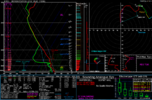
NAM Skew-T Athens GA for 8pm EDT. IF I am reading this Skew-T correctly, it shows that surface winds start from the S and gradually shift W as height increases. Wind speeds also increase with height. Helicity shows 315 at 1km and 445 at 3km, both significantly elevated. Shear starts at 37 at 1km, then increases to 63 and 60 at 1km and 6km respectively. MLCAPE (mixed layer convective available potential energy) is also elevated at 1175.

The shift due west along with elevated helicity and shear, combined with increased CAPE is what puts us at potential risk for severe weather/tornadoes.

I'm new to reading soundings, please correct me if I have anything wrong here. Not sure how reliable NAM soundings are at 4 days out either.nam_2023022812_084_34.05--83.45.png
 
Back
Top